In project management, effectively managing tasks, resources, and timelines is paramount to success. A powerful tool that aids in achieving this is the Gantt chart. A Gantt chart is a visual representation of a project schedule, displaying tasks as horizontal bars along a timeline. Its importance lies in its ability to clearly illustrate task dependencies, start and end dates, and overall project duration. This visual clarity makes Gantt charts indispensable for successful planning and tracking of project progress, allowing managers to quickly identify potential bottlenecks, adjust schedules, and ensure projects stay on track.
This article delves into the significance of Gantt charts, exploring their visualization capabilities, key features, and diverse applications across various industries.
Furthermore, we’ll examine practical tools for leveraging Gantt charts, including the Virto Gantt Chart App for SharePoint Online & Microsoft 365, and explore Virto Calendar’s Gantt Chart View for enhanced visualization of time allocation to specific tasks.
What’s a Gantt Chart, and What Is It Used For?
In this section, we’ll unpack everything you need to know about Gantt charts—from their fundamental definition and historical roots to their modern-day applications. We’ll examine the essential components that make these charts so effective, discuss how cutting-edge trends like AI are revolutionizing their use, and explore diverse real-world applications across different industries.
What does Gantt mean?: Gantt chart meaning
A Gantt chart is a visual project management tool that displays project activities against time, providing a clear and intuitive way to plan, coordinate, and track various project components. Think of it as a sophisticated timeline that not only shows what needs to be done but also illustrates how different tasks relate to each other, who’s responsible for each component, and how the project is progressing overall.
The story behind this revolutionary tool begins with Henry Gantt, an American mechanical engineer and management consultant who developed this chart format in the early 1910s. Initially used for major infrastructure projects like the Hoover Dam and Interstate Highway System, Gantt charts gained widespread adoption due to their remarkable effectiveness in simplifying complex project visualization.
Today, Gantt charts have evolved far beyond their paper-based origins. Modern digital versions incorporate artificial intelligence to optimize task scheduling, automatically detect potential conflicts, and even suggest optimal resource allocation. AI-powered features can now predict project bottlenecks, recommend timeline adjustments, and provide intelligent insights based on historical project data, making project management more proactive than ever before.
👉 So, what is Gantt chart view? Gantt chart view is a visual representation of a project schedule that displays tasks as horizontal bars along a timeline. This view allows for easy visualization of task durations, dependencies, and the overall project timeline. It helps track progress by showing the start and end dates of each task, as well as their current status. This visual format simplifies complex project schedules and facilitates efficient project management. Gantt chart view is particularly useful for identifying potential scheduling conflicts and ensuring projects stay on track.
What does a Gantt look like?: Main elements/components of a Gantt chart
A well-designed Gantt chart consists of several key elements working together to provide a comprehensive project overview:
- Timeline: The horizontal axis displays time periods (days, weeks, months, or quarters)
- Tasks: Listed vertically on the left side, representing project activities
- Bars: Horizontal bars showing task duration and timing
- Dependencies: Arrows or lines connecting related tasks
- Milestones: Key project checkpoints marked with special symbols
- Progress indicators: Visual representations showing task completion status
- Resource allocation: Team member assignments and workload distribution
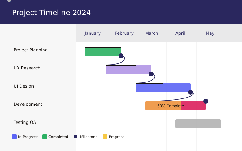
The chart works by creating a visual flow of project activities. Each task is represented by a bar whose length corresponds to its duration, while its position indicates when it starts and ends. Dependencies between tasks are shown as lines connecting the bars, making it easy to see how delays in one task might affect others.
👉 Gantt diagram vs Gantt chart: what’s the difference? “Gantt chart” and “Gantt diagram” are essentially interchangeable terms referring to the same visual project management tool. There’s no practical difference between them. Both visually represent project schedules, displaying tasks, durations, and dependencies. Whether you call it a chart or a diagram, the core functionality remains identical. Think of it like “soda” versus “pop”—different words, same drink. Same goes to “diagrama Gantt” and “Gantt schedule”—again, there’s no real difference in functionality.
Typical use cases: What is a Gantt chart used for?
Gantt charts have become indispensable across numerous industries, serving as a universal language for project management and coordination. Their versatility and visual clarity make them particularly valuable in complex, multi-stakeholder environments where timing and dependencies are crucial.
Construction projects
In the construction industry, Gantt charts serve as the backbone of project planning, orchestrating the intricate dance of multiple contractors, resources, and timelines. They help prevent costly delays and ensure safety compliance by mapping out:
- Building development phases—from groundbreaking to finishing touches
- Resource scheduling—coordinating equipment, materials, and labor
- Contractor coordination—synchronizing specialized teams
- Permit and inspection timing—ensuring regulatory compliance at each stage
Software development
Modern software development relies heavily on Gantt charts to maintain agile workflows while keeping sight of broader project goals. Development teams use them to visualize:
- Sprint planning—breaking down complex features into manageable iterations
- Feature rollouts—coordinating different aspects of functionality
- Testing phases—ensuring quality at each development stage
- Release schedules—managing deployment and user adoption
Product launches
When bringing new products to market, Gantt charts help organizations orchestrate the myriad activities required for a successful launch. Marketing teams, manufacturers, and distributors can align their efforts through:
- Marketing campaign coordination—from teaser campaigns to post-launch activities
- Production timelines—ensuring product availability meets demand
- Distribution planning—coordinating logistics and retail placement
- Event scheduling—synchronizing launch events across different markets
Event management
For event planners, Gantt charts transform complex logistics into manageable sequences, ensuring nothing falls through the cracks. They’re particularly crucial for:
- Venue preparation—from initial setup to last-minute adjustments
- Vendor coordination—managing caterers, decorators, and technical teams
- Marketing activities—timing promotional efforts for maximum impact
- Setup and breakdown scheduling—ensuring smooth transitions
Beyond these specific applications, Gantt charts excel in scenarios requiring precise coordination across multiple teams and dependencies. Consider a software development project: while UI designers work on the user interface, backend developers can simultaneously build the supporting infrastructure. The Gantt chart visualizes these parallel workflows while highlighting critical handoff points, such as when front-end development needs completed designs to proceed.
Healthcare facility operations
In healthcare settings, Gantt charts help manage everything from facility renovations to patient care protocols. They’re particularly valuable for:
- Department relocations during renovations
- Equipment installation and staff training
- Implementation of new patient care protocols
- Coordination of multiple medical teams
Research and development
R&D teams use Gantt charts to track complex research projects and product development cycles:
- Laboratory testing phases
- Clinical trials coordination
- Patent application timelines
- Technology transfer processes
The true power of Gantt charts lies in their ability to transform complex, interconnected activities into clear, actionable visualizations. They provide stakeholders at all levels—from executives to team members—with a shared understanding of project timelines, dependencies, and progress. This universal comprehension makes them an invaluable tool for project management across any industry where timing, resources, and coordination play crucial roles.
Moreover, with the advent of digital Gantt chart tools, teams can now collaborate in real-time, adjusting timelines and dependencies as projects evolve. This flexibility, combined with their visual clarity, makes Gantt charts more relevant than ever in today’s interconnected project environments.
👉 What is the main purpose of a Gantt chart? The main purpose of a Gantt chart is to provide a visual representation of a project’s schedule, showing tasks, their durations, dependencies, and overall progress over time. This allows for effective project planning, monitoring, and control.
How to Use a Gantt Chart
Creating an effective Gantt chart is more than just plotting tasks on a timeline—it’s about creating a living document that guides your project to success. Let’s explore how to create and maximize the value of Gantt charts in your project management workflow.
What does a Gantt chart look like?: Types of Gantt charts
Gantt charts come in several sophisticated formats, each designed to address specific project management challenges and organizational needs. Understanding these variations helps project managers choose the most effective visualization for their particular context.
- Horizontal Gantt charts
The traditional horizontal Gantt chart remains the most widely recognized and utilized format, with good reason. This classic layout presents time flowing from left to right—a natural progression that mirrors how most cultures read and process information. It provides an intuitive visualization that even stakeholders unfamiliar with project management can quickly grasp.
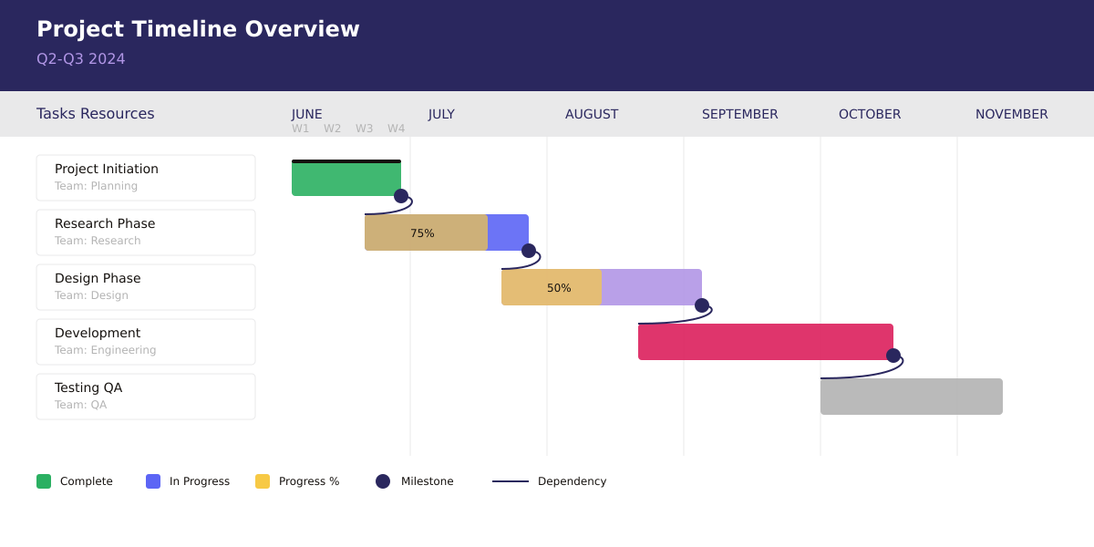
These charts excel in traditional project environments where:
- Traditional project management methodologies demand detailed timeline visibility
- Clear visualization of task duration helps teams understand resource commitments
- Easy identification of overlapping activities enables better resource allocation
The horizontal format particularly shines in complex projects where understanding task relationships is crucial. For example, in construction projects, it clearly shows how electrical work must follow structural completion but can overlap with plumbing installation. This visual clarity helps project managers optimize schedules and identify potential bottlenecks before they occur.
- Vertical Gantt charts
As mobile devices increasingly become primary work tools, vertical Gantt charts have emerged as an innovative solution to modern project management challenges. This format transforms the traditional timeline into a top-to-bottom flow, adapting to how we naturally interact with mobile devices.
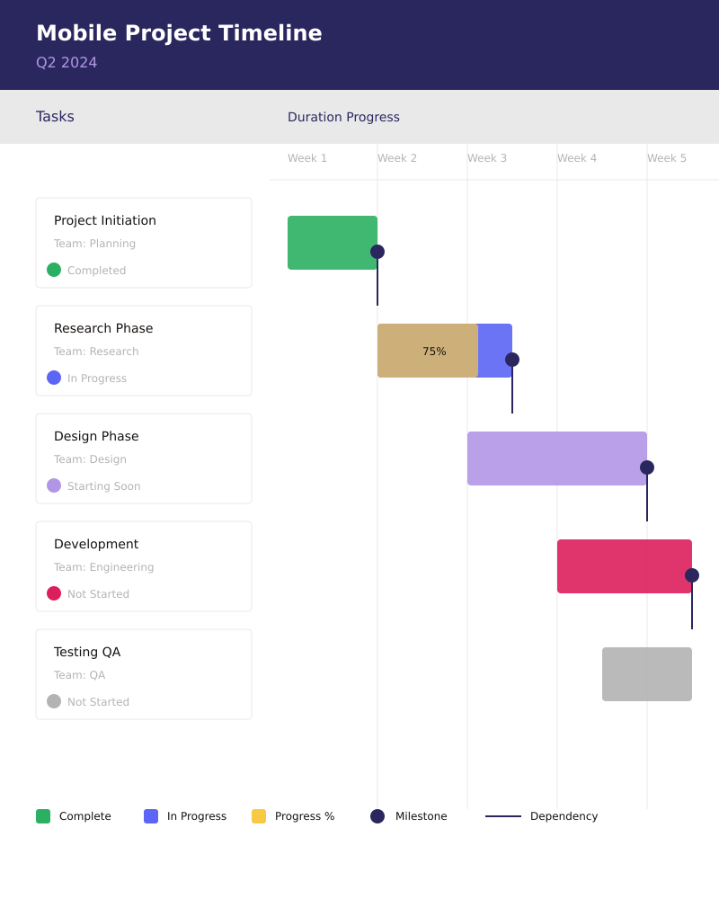
These charts have found particular success in agile environments where:
- Better suited for mobile devices, allowing team members to access project timelines on the go
- Easier to read on narrow screens, making them ideal for tablet and smartphone viewing
- Natural scrolling for long project lists matches how users typically interact with mobile interfaces
The vertical format has proven especially valuable in software development projects where teams often need to quickly check project status during stand-up meetings or while moving between work stations. Its mobile-friendly nature supports the agile principle of continuous collaboration and immediate access to project information.
- Hierarchical Gantt charts
Hierarchical Gantt charts represent the evolution of project visualization for complex, multi-layered initiatives. These sophisticated charts add depth to traditional timeline views by incorporating organizational structure and task relationships directly into the visualization.
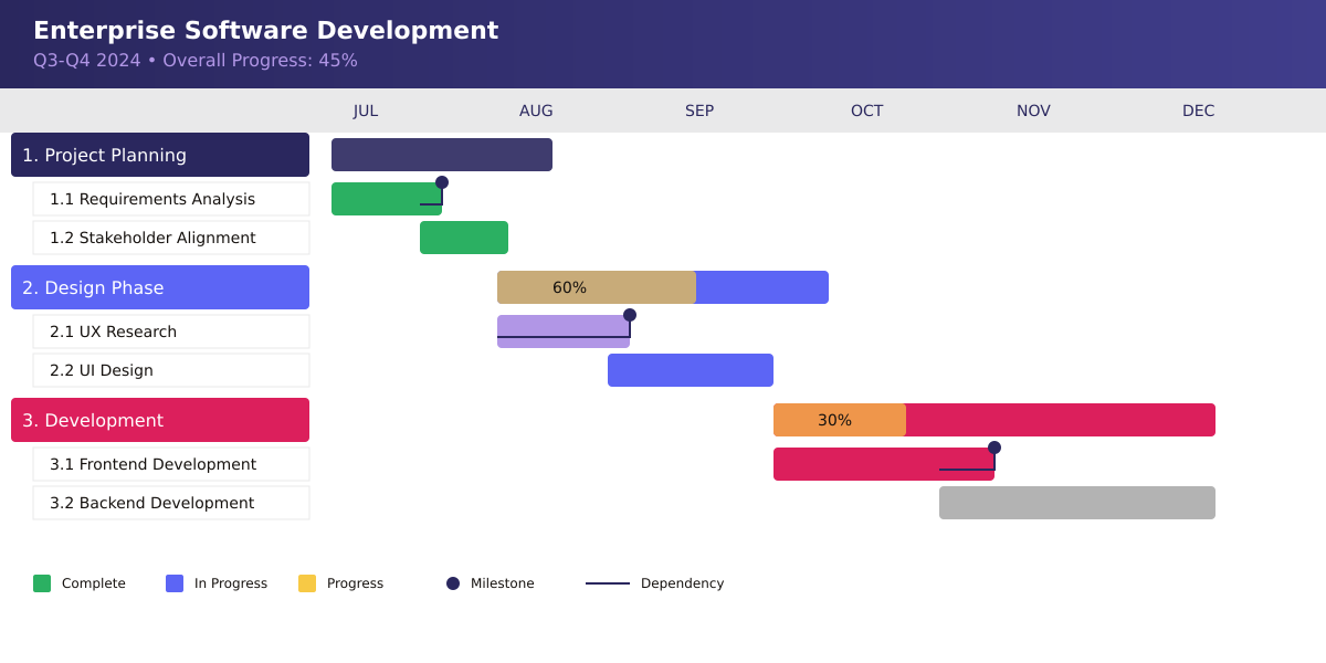
They prove invaluable in enterprise-level projects where:
- Shows parent-child task relationships, creating clear lines of responsibility and dependency
- Enables work breakdown structure visualization, helping teams understand how individual tasks contribute to larger objectives
- Facilitates resource allocation across project levels, ensuring efficient use of team capabilities
For example, in a product launch project, a hierarchical Gantt chart might show how marketing, development, and production tasks nest within larger phase objectives. This structure helps team members understand both their immediate responsibilities and how their work contributes to broader project goals.
The hierarchical format excels in situations requiring multiple levels of detail, such as enterprise software implementations or organizational transformations. It allows managers to collapse or expand different levels of detail as needed, providing both high-level overviews for executive presentations and detailed task breakdowns for team execution.
Each of these formats serves distinct needs while maintaining the core strength of Gantt charts: visual representation of project timelines and relationships. The choice between them often depends on factors such as:
- Project complexity and scale
- Team’s preferred working methods
- Technology infrastructure and preferences
- Stakeholder communication needs
- Required level of detail
Understanding these nuances helps project managers select the most appropriate format for their specific needs, ensuring effective project visualization and communication across all levels of the organization.
As project management tools continue to evolve, we’re seeing innovative hybrid approaches that combine elements from different formats, allowing teams to switch between views based on their current needs. This flexibility ensures that Gantt charts remain relevant and valuable in an ever-changing project management landscape.
How do you create a Gantt view?: Creating a Gantt view
Creating a Gantt chart requires careful planning and attention to detail to ensure it serves as an effective project management tool. Below, we’ll provide comprehensive step-by-step instructions that cover every aspect of building a functional Gantt chart, from initial task definition and timeline setup to resource allocation and progress tracking.
- Task definition: The foundation of your project plan
The journey of creating an effective Gantt chart begins with comprehensive task definition. This crucial first step involves breaking down your project into its essential components. Start by gathering all stakeholders to brainstorm and document every necessary task, ensuring nothing is overlooked.
- List all project tasks: Begin with high-level objectives and gradually break them down into specific, actionable items
- Break down complex tasks into manageable subtasks: Ensure no task is too large to effectively track or complete
- Assign clear, descriptive names to each task: Use specific, action-oriented language that leaves no room for ambiguity
- Estimate duration for each task: Work with team members to establish realistic timeframes based on past experience and available resources
- Timeline Setup: Creating your project’s backbone
With your tasks defined, the next step is establishing a realistic timeline that will serve as your project’s framework. This stage requires careful consideration of various time-related factors and project constraints.
- Determine project start and end dates: Consider all relevant factors, including resource availability, budget constraints, and external deadlines
- Choose appropriate time scale: Select between days, weeks, or months based on project duration and level of detail needed
- Set working and non-working periods: Account for holidays, weekends, and other scheduled downtimes
- Define key project phases: Group related tasks into logical phases that align with project milestones
- Task sequencing: Building the Logical Flow
Task sequencing transforms your list of activities into a coherent workflow. This step is crucial for understanding how different project elements interact and influence each other.
- Identify dependencies between tasks: Determine which tasks must be completed before others can begin, considering both mandatory and discretionary dependencies
- Set task relationships: Define the nature of these dependencies:
- Finish-to-start: The most common type, where one task must finish before another can begin
- Start-to-start: Tasks that can or must begin simultaneously
- Finish-to-finish: Tasks that must conclude together
- Mark critical path activities: Identify the sequence of tasks that determines your project’s minimum duration
- Establish milestones: Place markers at significant points in your project to help track progress and maintain momentum
- Resource allocation: Matching tasks with team members
Resource allocation involves strategically assigning your available resources to maximize efficiency while preventing overallocation and burnout.
- Assign team members to tasks: Match skills and experience with task requirements, considering both technical and soft skills
- Define role responsibilities: Clearly outline what each team member is responsible for, including decision-making authority and reporting requirements
- Balance workload across team: Ensure no team member is overloaded while others are underutilized
- Account for resource availability: Consider vacation schedules, part-time arrangements, and other commitments
- Progress Tracking: Keeping your project on course
The final step is establishing a system for monitoring and updating progress. This ongoing process is essential for maintaining project momentum and addressing issues before they become problems.
- Update task completion status: Regularly record progress on active tasks:
- Percentage complete
- Actual start and finish dates
- Any deviations from planned duration
- Monitor milestone achievement: Track the completion of key project phases and deliverables
- Track actual vs. planned progress: Compare current project status against baseline plans to identify potential issues early
- Adjust timeline as needed: Be prepared to make informed adjustments based on:
- Actual progress data
- Changed circumstances
- New requirements
- Resource availability changes
Creating a Gantt chart is not a one-time exercise but rather an iterative process that continues throughout the project lifecycle. Regular reviews and updates ensure your Gantt chart remains a valuable tool for project management rather than becoming outdated documentation.
The key to success lies in striking the right balance between detail and maintainability. While it’s important to be thorough, avoid creating a chart that’s so complex it becomes impractical to maintain. Focus on capturing the essential elements that will help you and your team successfully navigate the project to completion.
👉 So, how do you make a Gantt diagram? First, list all your project tasks and their estimated durations. Then, determine task dependencies (which tasks must be completed before others can begin). Next, choose a software tool or template (many are available online). Input your tasks, durations, and dependencies into the chosen tool. Finally, the software will generate the Gantt diagram, visually representing your project schedule.
Popular Gantt chart tools
The landscape of Gantt chart software has evolved significantly, offering solutions for every project size, budget, and complexity level. Modern project management teams can choose from a diverse ecosystem of tools, each with unique strengths and specialized features. Let’s explore the main categories and their standout options.
Advanced solutions
For enterprises and large-scale projects requiring sophisticated project management capabilities, high-end solutions offer comprehensive features and robust integration options:
- Microsoft Project remains the industry standard for enterprise-grade project management. It excels in handling complex projects with multiple dependencies, resource pools, and detailed reporting requirements. Its deep integration with the Microsoft ecosystem makes it particularly valuable for organizations heavily invested in Microsoft tools.
- Oracle Primavera dominates the construction and engineering sectors, offering specialized features for large-scale infrastructure projects. It provides unmatched capabilities for handling thousands of tasks, multiple contractors, and complex resource allocation scenarios. The platform stands out for its:
- Advanced risk analysis tools
- Multi-project portfolio management
- Sophisticated resource leveling capabilities
- Industry-specific templates and workflows
- Virto Gantt Chart App transforms project management for SharePoint users by providing seamless integration with existing SharePoint workflows. It bridges the gap between enterprise content management and project tracking, offering:
- Native SharePoint integration
- Real-time collaboration features
- Customizable views and filters
- Advanced permission management
Mid-range options
For growing teams and medium-sized projects, these solutions balance functionality with user-friendly interfaces:
- Asana has emerged as a leader in this space, offering robust Gantt chart features (Timeline view) within an intuitive interface. It excels at:
- Drag-and-drop timeline adjustments
- Automated dependency management
- Team collaboration features
- Integration with popular work tools
- Trello with Power-Ups transforms the simple kanban board into a capable Gantt chart tool. While maintaining its core simplicity, it adds:
- Timeline visualization
- Resource management
- Progress tracking
- Calendar integration
- monday.com stands out for its visual approach to project management. It offers:
- Highly customizable views
- Intuitive collaboration features
- Automation capabilities
- Rich integration options
Basic tools
For teams with simpler needs or those just starting with Gantt charts, several accessible options provide essential functionality:
- Excel offers surprising flexibility for creating custom Gantt charts. While requiring manual setup, it provides:
- Complete control over layout and design
- Familiar interface for many users
- Custom calculations and formulas
- No additional software costs
- Google Sheets serves as an excellent collaborative alternative to Excel, offering:
- Real-time collaboration
- Cloud-based accessibility
- Template sharing
- Basic automation features
- Free online Gantt makers have democratized access to project visualization tools. These web-based solutions typically offer:
- Quick setup and learning curve
- Basic project tracking features
- Export and sharing options
- Essential collaboration tools
When selecting a Gantt chart tool, consider factors beyond just features and price. Think about:
- Team size and technical expertise
- Integration requirements with existing tools
- Scalability needs as your project grows
- Collaboration and sharing requirements
- Available training and support resources
- Security and compliance requirements
The right tool should align with your team’s workflow while providing room for growth and adaptation as your project management needs evolve. Remember that the most expensive or feature-rich solution isn’t always the best choice; the key is finding a tool that your team will actually use effectively.
How do you visualize a Gantt chart?: Visualizing tasks on a Gantt chart
The power of a Gantt chart lies in its visual representation of complex project data. Effective visualization transforms raw project information into instantly understandable insights, enabling quick decision-making and clear communication across teams. Let’s explore how different visual elements combine to create a comprehensive project view.
Color coding: The visual language of project status
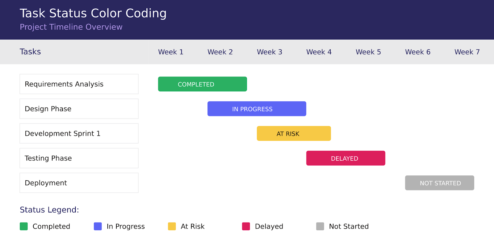
Color coding serves as an intuitive language that allows stakeholders to grasp project status at a glance. When implemented consistently, colors become powerful indicators that trigger immediate recognition and appropriate responses. For instance:
- Green symbolizes completed tasks, providing immediate visual confirmation of progress.
- Blue represents in-progress tasks, showing active work areas.
- Yellow flags at-risk tasks, serving as an early warning system.
- Red signals delayed tasks, demanding immediate attention.
- Gray indicates not-started tasks, providing context for future work.
👉 Learn more about color coding and categorization in the dedicated articles on our blog:
Why You Need to Color-Code Your Calendar: 3 Science-Backed Tips
Optimize Your Work Calendar: Explore Categories Ideas for Google, Outlook, and MS Teams
Status indicators: Adding depth to visual information
Beyond basic color coding, status indicators serve as the sophisticated visual language of project management, providing nuanced insights into task progress, relationships, and resource allocation. These indicators transform complex project data into intuitive visual cues that enable quick decision-making and effective project steering.
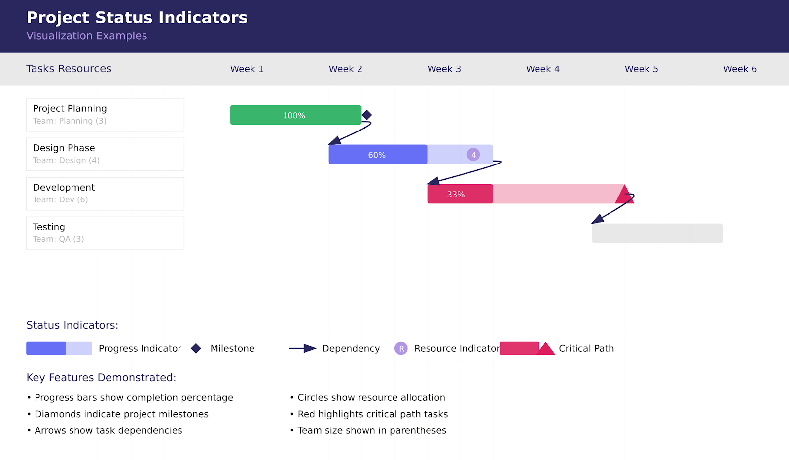
Let’s explore each type of status indicator and its crucial role in project visualization.
- Percentage complete indicators
Percentage complete indicators bring mathematical precision to progress tracking, transforming abstract concepts of completion into concrete, measurable metrics. These powerful visual tools serve as the project’s vital signs, offering immediate insight into task status and overall project health.
These indicators can manifest in various forms:
- Progress bars within task bars provide an intuitive visual representation of completion status, allowing for quick assessment at a glance
- Numerical percentages offer precise measurements, ideal for detailed reporting and analysis
- Graduated shading creates a subtle visual progression that can indicate both progress and remaining work
- Fractional completions help break down complex tasks into manageable chunks
This detailed approach to progress tracking enables teams to:
- Monitor progress with unprecedented precision, ensuring no detail goes unnoticed
- Calculate earned value metrics that tie progress to budget and schedule performance
- Identify trends in performance that might indicate underlying issues or opportunities
- Make data-driven forecasts based on actual performance patterns
- Milestone markers
Milestone markers act as the project’s navigation beacons, marking significant moments in the project journey. These visual anchors help teams maintain direction and momentum while providing clear reference points for stakeholder communication.
These distinctive symbols serve multiple purposes:
- Mark significant achievements that represent major project progress
- Signal important phase transitions that might require special attention or resources
- Trigger scheduled review points that ensure quality and alignment
- Guide stakeholder communications by providing clear reference points
To maximize their effectiveness, milestone visualization should include:
- Distinctive shapes that stand out from regular task bars
- Prominent positioning that draws attention to key dates
- Clear labeling that communicates milestone significance
- Status indicators that show completion state
- Dependency arrows
Dependency arrows create the project’s roadmap, illustrating the complex web of relationships between tasks. These visual connectors transform isolated task bars into a coherent network of related activities.
These critical connectors serve to:
- Show logical sequences that must be followed for project success
- Identify potential bottlenecks before they impact project progress
- Highlight critical paths that determine project duration
- Guide scheduling decisions by visualizing task relationships
Arrow styles can communicate different types of relationships:
- Finish-to-Start dependencies indicate sequential tasks
- Start-to-Start relationships show parallel activities
- Finish-to-Finish connections link related completions
- Lag time requirements visualize necessary delays
- Resource indicators
Resource indicators function as the project’s capacity gauge, providing crucial insights into work allocation and resource utilization. They help prevent overallocation while ensuring optimal resource distribution.
These indicators can display:
- Team assignments showing who’s responsible for each task
- Equipment allocation tracking critical resource usage
- Material requirements highlighting supply chain dependencies
- Workload distribution revealing capacity utilization
This visual resource tracking enables teams to:
- Prevent resource overallocation before it causes burnout
- Identify skill gaps that might require additional training or hiring
- Balance workloads across team members and departments
- Optimize resource usage for maximum efficiency
- Critical path highlighting
Critical path highlighting acts as the project’s strategic compass, emphasizing the sequence of tasks that directly impact project completion. This crucial visualization helps teams focus on what matters most.
This visualization technique:
- Identifies project constraints that could affect completion
- Guides priority setting for resource allocation
- Focuses management attention on crucial activities
- Supports schedule optimization efforts
Modern Gantt chart tools often allow customization of these visual elements to match organizational preferences and project needs. The key is maintaining consistency in visual language while providing sufficient detail for effective project management. Remember that the goal is to enhance understanding, not create visual complexity. Each visual element should serve a specific purpose in communicating project information.
For maximum effectiveness, consider:
- Your audience’s needs and preferences
- The level of detail required
- The frequency of updates
- The primary use cases for your Gantt chart
By thoughtfully combining these visual elements, you create a powerful tool for project visualization that supports both strategic planning and day-to-day project management.
Comparison of Gantt chart with other methods
In project management tools, three primary visualization methods stand out: Gantt charts, Timeline views, and Kanban boards. Each brings unique strengths to project management, and understanding their distinct characteristics helps in choosing the right approach for specific project needs.
Gantt vs. timeline view: What is the difference between Gantt view and timeline view?
While Gantt charts and timeline views might appear similar at first glance, they serve fundamentally different purposes in project management. Think of a Gantt chart as a detailed roadmap, while a timeline view is more like a bird’s-eye view of the journey.
Gantt view offers comprehensive project control through:
- Task dependency mapping: showing how different activities interconnect and influence each other
- Resource allocation visualization: displaying who’s responsible for what and when
- Duration indicators: clearly showing how long each task will take
- Project hierarchy representation: demonstrating how tasks nest within larger project phases
- Complex project management: handling multiple intersecting timelines and dependencies
These features make Gantt charts particularly valuable in scenarios where project managers need to coordinate multiple teams, resources, and interdependent activities. For instance, in software development, a Gantt chart can show how frontend development depends on UI design completion while backend development proceeds in parallel.
Timeline view, by contrast, excels in simplicity and clarity:
- Clean, straightforward visual representation that anyone can understand
- Clear emphasis on key dates and project milestones
- Stakeholder-friendly format that communicates project progress effectively
- High-level perspective that keeps teams focused on major objectives
- Streamlined approach ideal for simpler project scheduling
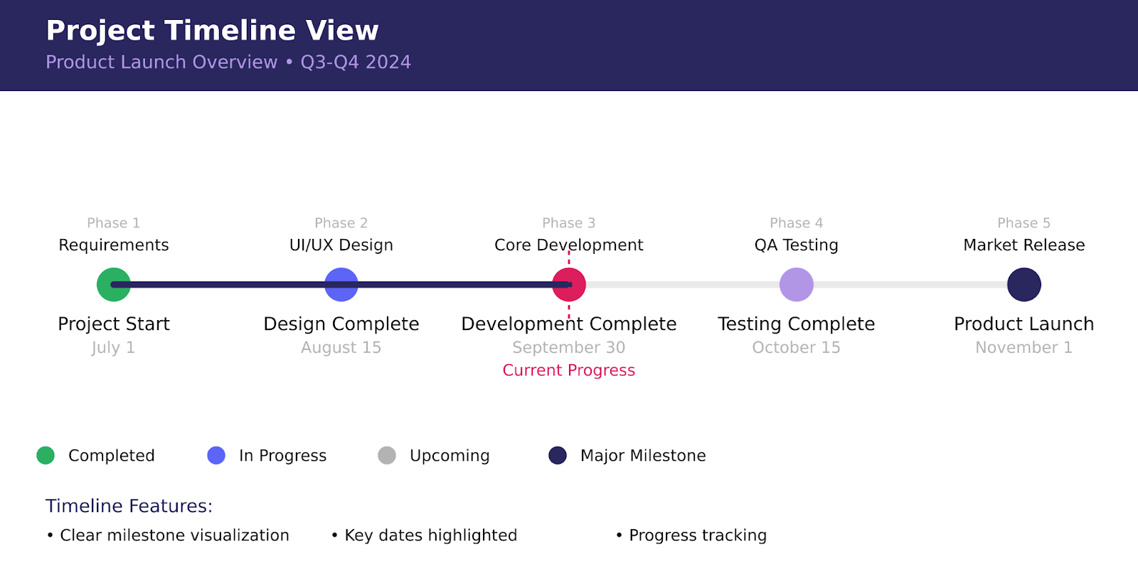
Timeline views prove invaluable when communicating with stakeholders who need to understand project progress without getting lost in technical details. They’re perfect for executive presentations or when sharing project status with clients.
👉 Learn more about project timelines here: How to Build and Use a Project Management Timeline: Tips and Examples
Gantt vs. Kanban: What is the difference between Gantt view and Kanban view?
The comparison between Gantt and Kanban views represents a fascinating contrast between long-term planning and day-to-day execution. These approaches, while different, often complement each other beautifully in a well-rounded project management strategy.
Gantt view strengths emphasize strategic planning:
- Comprehensive timeline visualization showing the entire project journey
- Detailed resource planning capabilities for optimal allocation
- Clear dependency mapping to prevent bottlenecks
- Long-term planning functionality for strategic decision-making
- Schedule management tools for complex project coordination
These capabilities make Gantt charts indispensable for project managers who need to maintain a clear view of the entire project landscape while managing multiple moving parts.
Kanban view strengths focus on operational efficiency:
- Work in progress limits that prevent team overload
- Real-time status updates for immediate visibility
- Team workload balancing for optimal productivity
- Agile workflow management supporting iterative development
- Quick task prioritization for dynamic environments
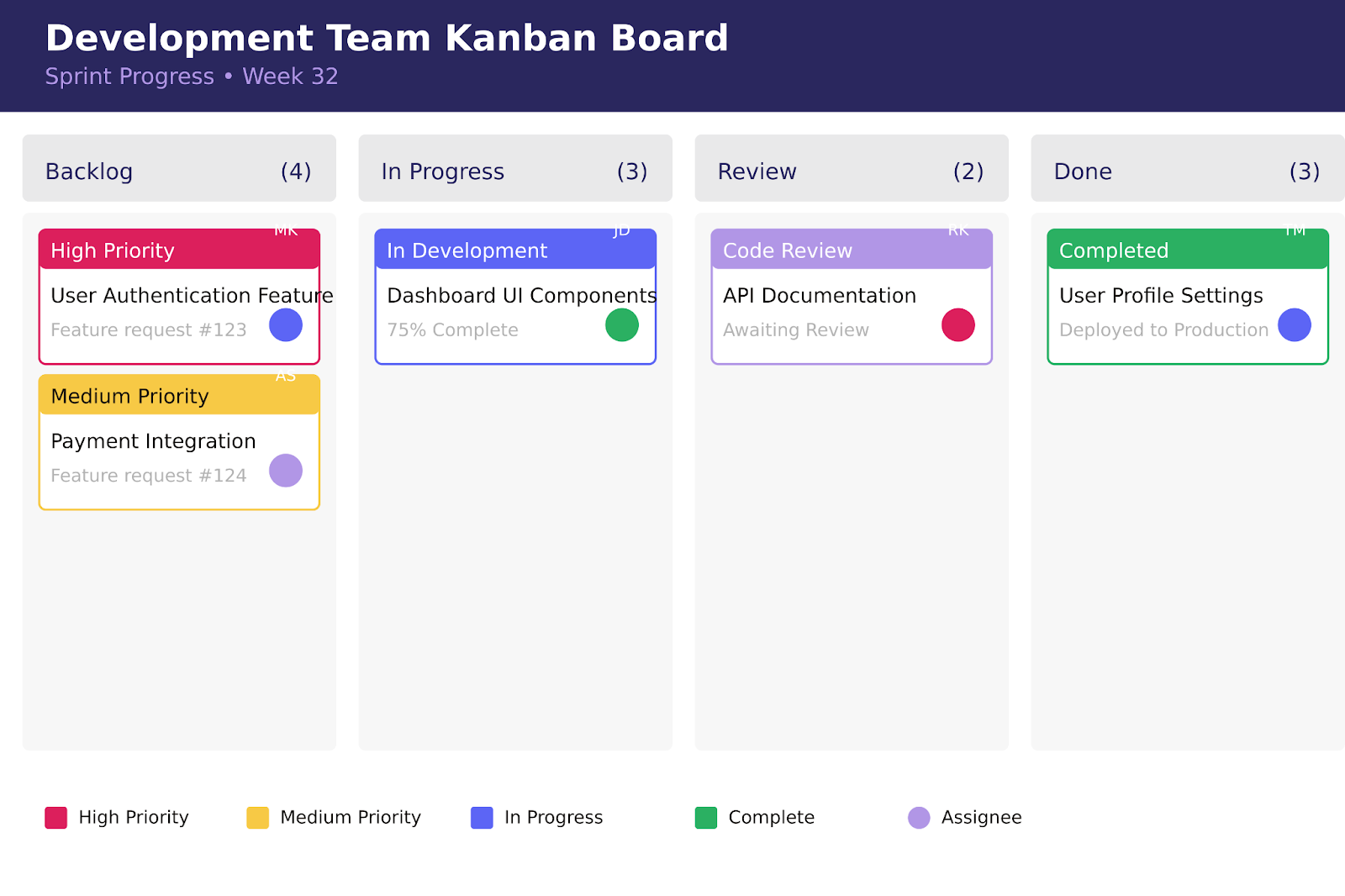
Kanban’s visual approach to workflow management makes it particularly effective for teams working in fast-paced, iterative environments where priorities can shift rapidly.
👉 To learn more about the differences between Kanban and Gantt, please browse through: Gantt Chart vs Kanban Board
Choosing between methods
The selection of a project management visualization tool should align with your specific project needs and team dynamics. Consider using:
- Gantt Charts when your project demands:
- Detailed scheduling with multiple dependencies
- Complex resource allocation across teams
- Clear visualization of task relationships
- Long-term project planning and tracking
This makes Gantt charts ideal for projects like construction, product development, or any initiative with multiple interdependent phases.
- Kanban when you need:
- Flexible workflow management
- Quick adaptation to changing priorities
- Visual task progression tracking
- Efficient team capacity management
Kanban boards excel in software development sprints, marketing campaigns, and other scenarios requiring agile response to change.
- Timeline when the focus is on:
- High-level project overview
- Clear communication of key dates
- Simple stakeholder updates
- Basic project progression tracking
Timeline views work particularly well for executive reporting, client presentations, and high-level project planning.
The true art of project management often lies in combining these methods strategically. Many successful project managers use Gantt charts for overall project planning and tracking, Kanban boards for day-to-day task management, and Timeline views for stakeholder communications. This integrated approach leverages each tool’s strengths while compensating for their limitations.
For example, a software development team might use:
- A Gantt chart to plan the overall product release
- Kanban boards to manage daily development tasks
- Timeline views for monthly stakeholder updates
This combination ensures comprehensive project management while maintaining flexibility and clear communication at all levels.
Benefits of Using a Gantt Chart and Practical Tips
In this section, we’ll take a closer look at the substantial benefits that Gantt views bring to project management and explore practical tips for leveraging these tools effectively.
Benefits of using a Gantt chart
The power of Gantt charts extends far beyond simple task visualization, offering comprehensive project management capabilities that enhance team efficiency and project success. Let’s explore the key advantages these visual tools bring to modern project management.
- Control over deadlines and tasks
Gantt charts serve as a dynamic command center for project timing and task management. By providing a clear visual timeline, they enable project managers to:
- Track real-time progress against planned schedules
- Identify potential delays before they become critical
- Adjust resources and timelines proactively
- Maintain clear visibility of project milestones
This enhanced control helps teams stay focused on deliverables while maintaining schedule integrity. For example, when a task falls behind schedule, the visual nature of Gantt charts immediately highlights the impact on dependent tasks, allowing for quick corrective action.
- Improving coordination and communication
In a remote work environment, effective team coordination has become more crucial than ever. Gantt charts excel as communication tools by:
- Providing a single source of truth for project status
- Enabling clear visualization of task ownership and responsibilities
- Facilitating discussions about timeline adjustments
- Supporting asynchronous team collaboration
Teams can use Gantt charts as a central reference point during meetings, making it easier to discuss progress, challenges, and next steps with all stakeholders aligned on the same visual representation.
- Visualizing processes
The true strength of Gantt charts lies in their ability to transform complex project relationships into clear, actionable visuals. They excel at:
- Mapping interconnected project phases
- Highlighting critical path activities
- Showing cross-departmental dependencies
- Illustrating resource allocation across time
This comprehensive visualization helps teams understand not just their individual tasks, but how their work fits into the broader project context.
- Team resource management
Effective resource allocation is crucial for project success, and Gantt charts provide powerful tools for managing team workload:
- Clear visualization of task assignments
- Identification of resource conflicts
- Workload balancing opportunities
- Capacity planning capabilities
Project managers can quickly identify overallocation issues and redistribute work to maintain team efficiency and prevent burnout.
- Risk management
Gantt charts serve as early warning systems for project risks by:
- Highlighting task dependencies that could cause cascading delays
- Identifying resource constraints before they become critical
- Showing timeline conflicts that might affect deliverables
- Enabling what-if scenario planning
This proactive approach to risk management allows teams to develop contingency plans before issues arise.
Practical tips for using a Gantt chart: How to use Gantt chart effectively
The true power of a Gantt chart lies not just in its creation, but in how effectively it’s maintained and utilized throughout the project lifecycle. Let’s explore key strategies for maximizing the value of this versatile project management tool.
Optimization
Successful Gantt chart implementation requires consistent attention to detail and regular maintenance. Think of your Gantt chart as a living document that needs regular care to remain effective:
- Keep task dependencies updated and accurate: Dependencies form the backbone of your project timeline. Regular reviews ensure these relationships reflect current project realities. For example, if your software development project originally required sequential testing but new automation tools enable parallel testing, update your dependencies to reflect this efficiency gain.
- Regularly review and adjust timelines based on actual progress: Projects rarely proceed exactly as planned. Weekly progress reviews help identify discrepancies between planned and actual progress early. When a design review takes three days longer than planned, quick timeline adjustments can prevent cascading delays across dependent tasks.
- Maintain clear and consistent naming conventions: Task names should tell a story at a glance. Instead of vague labels like “Phase 1” or “Testing,” use specific, action-oriented names like “User Interface Design” or “Integration Testing.” This clarity helps team members quickly understand their responsibilities and how their work fits into the larger project context.
- Use color coding effectively to highlight priorities and status: Strategic use of colors can transform your Gantt chart into an intuitive visual dashboard. For instance, use red for critical path tasks, yellow for at-risk activities, and green for completed work. This visual system allows stakeholders to quickly gauge project health without diving into details.
Scaling
As projects grow in complexity, maintaining clarity while providing necessary detail becomes crucial. Effective scaling strategies help manage this balance:
- Using summary tasks for high-level views: Think of summary tasks as chapter headings in your project story. They provide context and organization without overwhelming viewers with detail. For example, “User Authentication System” might be a summary task encompassing login, password recovery, and security testing subtasks.
- Creating hierarchical task structures: Well-organized hierarchies make complex projects digestible. Major phases break down into components, which further divide into specific tasks. This structure allows stakeholders to drill down to their needed level of detail while maintaining overall project perspective.
- Implementing rolling wave planning for long-term projects: Long-term projects benefit from progressive elaboration. Near-term activities have detailed task breakdowns, while future phases maintain higher-level planning until more information becomes available. This approach combines thorough immediate planning with flexible future adaptation.
- Maintaining appropriate detail levels for different audiences: Executive stakeholders might need only major milestones and delivery dates, while technical teams require detailed task breakdowns. Your Gantt chart should adapt to serve both audiences effectively.
Deviation Analysis
Regular analysis of schedule variations helps maintain project health and improves future planning accuracy:
- Track actual vs. planned progress regularly: Weekly comparison of planned versus actual progress helps identify trends before they become problems. Are certain types of tasks consistently taking longer than estimated? Are some teams completing work ahead of schedule? These patterns inform future planning and resource allocation.
- Document reasons for significant variations: Understanding why deviations occur is as important as identifying them. A task taking longer than planned might reveal a need for additional training, resource constraints, or unrealistic initial estimates. This documentation creates a valuable learning resource for future projects.
- Adjust future estimates based on historical performance: Use actual performance data to refine future estimates. If similar tasks consistently take 20% longer than planned, adjust upcoming estimates accordingly. This continuous improvement process leads to more accurate planning over time.
- Communicate changes to stakeholders promptly: When deviations necessitate timeline adjustments, quick, clear communication helps maintain stakeholder trust and enables proactive problem-solving. Regular status updates should highlight both challenges and proposed solutions.
By implementing these practical tips, project managers can transform their Gantt charts from simple timeline displays into powerful project management tools.
Common mistakes when working with a Gantt chart
Even the most experienced project managers can fall into common traps when using Gantt charts. Understanding these pitfalls and knowing how to avoid them can mean the difference between a useful project management tool and a time-consuming burden. Let’s explore the most significant challenges and their solutions.
Over-detailing: The perfectionist’s trap
One of the most common mistakes in Gantt chart creation is the pursuit of perfect detail. While thoroughness is admirable, excessive detail can transform a helpful visualization tool into an overwhelming mass of information that obscures rather than clarifies project progress.
Consider this scenario: A software development project manager includes every code review, daily stand-up, and email follow-up as individual tasks. The resulting Gantt chart becomes so dense with information that team members struggle to identify their primary responsibilities, and stakeholders can’t see the forest for the trees.
Instead, maintain clarity and usefulness by:
- Focus on key deliverables and milestones: Track significant achievements that mark project progress. Rather than listing every development task, focus on completed features or major component deliveries. For example, instead of tracking individual coding tasks, create a milestone for “User Authentication Module Complete.”
- Group minor tasks under summary activities: Create logical groupings that provide context without overwhelming detail. A summary task called “Frontend Development” might encompass numerous smaller tasks without cluttering the main chart view.
- Maintain appropriate detail levels for your audience: Consider who will use the chart and what information they need. Executive stakeholders might need only high-level milestones, while technical teams require more detailed breakdowns of their specific areas.
- Use progressive elaboration for future phases: Adopt a “rolling wave” approach where near-term activities have more detail than distant ones. This allows for natural evolution of the project plan as more information becomes available.
Lack of flexibility: The rigid planning syndrome
Another critical mistake is treating the Gantt chart as an unchangeable commandment rather than a living document. Projects are dynamic endeavors that require adaptable planning tools. A rigid approach to Gantt chart management can lead to missed opportunities and frustrated team members.
For example, if a critical resource becomes unexpectedly available earlier than planned, a flexible Gantt chart allows quick reallocation to take advantage of this opportunity. Conversely, a rigid approach might miss this chance for acceleration due to strict adherence to the original timeline.
To maintain necessary flexibility:
- Build in buffer time for unexpected delays: Include realistic padding in your timeline, especially for tasks with uncertain durations or external dependencies. This buffer provides breathing room for inevitable surprises without derailing the entire project schedule.
- Review and adjust dependencies regularly: Question whether task relationships still make sense as the project evolves. Sometimes, what seemed like a mandatory sequence in planning can be parallelized in execution with the right resources or approach.
- Allow for resource reallocation: Design your chart with the understanding that team members’ availability and capacity may change. Build in the ability to shift responsibilities and adjust timelines without breaking the entire project structure.
- Update the chart as project conditions change: Treat your Gantt chart as a dynamic tool that reflects current reality rather than an historical document. Regular updates keep the chart relevant and useful for decision-making.
The path to effective Gantt chart usage
Success with Gantt charts comes from finding the right balance between detail and simplicity, structure and flexibility. Remember that a Gantt chart is ultimately a communication tool; it should clarify rather than complicate project understanding.
When teams avoid these common pitfalls, Gantt charts become powerful allies in project management, providing:
- Clear visibility into project progress
- Flexible adaptation to changing conditions
- Appropriate detail for different stakeholders
- Effective resource management
- Realistic timeline management
The key is maintaining perspective on the chart’s primary purpose: facilitating project success through clear visualization and effective planning.
How to Improve Your Gantt Chart Experience with Virto Gantt Chart App
Modern project management demands tools that seamlessly integrate with existing workflows while providing powerful visualization and management capabilities. VirtoSoftware’s solutions for SharePoint Online & Microsoft 365 offer exactly this combination, transforming how teams interact with Gantt charts in their daily project management activities.
Benefits of Virto Gantt Chart App
The Virto Gantt Chart App revolutionizes project management by combining powerful features with intuitive usability. At its core, this enterprise-grade solution brings several key advantages to organizations using SharePoint Online & Microsoft 365:
- Seamless SharePoint integration: Unlike standalone Gantt chart tools, VirtoSoftware;s solution works directly with your existing SharePoint infrastructure:
- Transform SharePoint lists into comprehensive Gantt visualizations
- Maintain data consistency across all project views
- Access project information from anywhere within your Microsoft 365 environment
- Eliminate the need for data duplication or manual transfers
- Advanced visualization capabilities: Modern project management demands clear, actionable insights. The app delivers with:
- Interactive timeline adjustments through drag-and-drop functionality
- Customizable color-coding for different project elements
- Multiple view options to suit different stakeholder needs
- Clear visualization of task dependencies and relationships
- Enhanced task management: Direct task manipulation within the Gantt view enables teams to:
- Edit task details in real-time
- Create and modify dependencies instantly
- Set and track milestones
- Manage resource allocation effectively
The true value of the Virto Gantt Chart App becomes apparent when addressing common project management challenges:
- Dependency management: Complex project dependencies become manageable through intuitive visualization and control:
- Clearly see relationships between tasks
- Identify potential bottlenecks before they impact timelines
- Adjust dependencies with simple drag-and-drop actions
- Receive automatic updates when changes affect dependent tasks
- Big data visualization: Large projects remain navigable and comprehensible with:
- Efficient handling of extensive task lists
- Scalable views that maintain performance
- Clear organization of complex project hierarchies
- Easy filtering and sorting options
- Real-time progress tracking: Stay current with project status through:
- Automatic updates as tasks progress
- Visual completion indicators
- Resource utilization monitoring
- Timeline adjustment capabilities
Comparison with traditional Gantt charts
The Virto Gantt Chart App significantly enhances the traditional Gantt chart experience in several key areas:
| Feature category | Traditional Gantt charts | Virto Gantt Chart App |
| Data integration | • Standalone tools requiring manual data entry • Limited connectivity with other systems • Periodic manual updates needed • Isolated from other business tools | • Native SharePoint integration • Seamless Microsoft 365 ecosystem integration • Real-time data synchronization • Automatic updates across all views |
| Interaction capabilities | • Static visualizations • Limited adjustment options • Fixed views and formats • Manual timeline adjustments | • Dynamic, interactive interface • Drag-and-drop adjustments • Multiple customizable views • Real-time timeline modifications |
| Collaboration features | • Single-user focus • Limited sharing capabilities • Version control challenges • Email-based communication | • Multi-user collaboration • Real-time updates for all users • Built-in version control • Integrated communication tools |
| Security features | • Basic access controls • Limited audit capabilities • Manual backup requirements • Standalone security | • SharePoint security framework integration • Comprehensive audit trails • Automatic backup and recovery • Enterprise-grade security |
| Scalability | • Limited by file size • Performance issues with large projects • Fixed functionality • Manual scaling required | • Cloud-based scalability • Efficient handling of large projects • Regular feature updates • Automatic performance optimization |
Through these advanced features and capabilities, the Virto Gantt Chart App transforms traditional project management into a dynamic, collaborative experience. Whether managing small team projects or coordinating large enterprise initiatives, the app provides the tools needed for effective project visualization and control.
The result is a more efficient, collaborative, and successful project management environment where teams can focus on delivering results rather than managing tools. By leveraging the power of SharePoint Online & Microsoft 365, the Virto Gantt Chart App offers a natural extension of your existing project management capabilities, making it an ideal choice for organizations looking to enhance their project management toolkit.
Virto Calendar App: Adding another dimension

The Virto Calendar App complements the Gantt Chart App by offering additional visualization options, including a powerful Gantt view. This versatile tool brings several unique advantages:
- Multi-source integration
- Combine SharePoint lists with Exchange Online calendars
- Integrate external calendars via iCal
- Unified view of all project-related events
- Seamless Microsoft 365 integration
- Flexible view options: The app offers various views to suit different needs:
- Daily, weekly, and monthly calendar views
- Gantt views in both day and hour formats
- Multi-source view for comprehensive event tracking
- Year, flat year, and quarter views for long-term planning
- Gantt view capabilities: The Gantt view specifically offers:
- Task-based visualization in days or hours
- Event grouping for better organization
- Drag-and-drop event management
- Time allocation tracking
- Advanced features
- Color-coding for better event categorization
- Mini calendar for quick navigation
- Event creation and modification
- Resource management capabilities
By combining the power of the Virto Gantt Chart App with the versatility of the Virto Calendar App, organizations can create a comprehensive project management environment that leverages the best of both tools. The seamless integration with SharePoint Online & Microsoft 365 ensures that teams can focus on project execution rather than tool management, while the advanced visualization and management features provide the clarity and control needed for successful project delivery.
Conclusion
Throughout this article, we’ve explored how Gantt charts serve as powerful visual tools that transform abstract project plans into actionable timelines. Their ability to clearly display task dependencies, resource allocation, and project progress makes them invaluable for teams of all sizes, whether working on software development, construction projects, or product launches.
The key benefits we’ve discussed demonstrate why Gantt charts remain a cornerstone of modern project management. However, understanding these benefits is just the beginning. The real power of Gantt charts lies in their practical implementation and the tools you choose to create and manage them. As we’ve explored, modern solutions have transformed traditional Gantt charts into dynamic, collaborative tools that integrate seamlessly with existing workflows.
For teams already working within the Microsoft 365 ecosystem, the Virto Gantt Chart App for SharePoint Online offers a natural extension of their project management capabilities. By combining familiar SharePoint functionality with powerful Gantt visualization features, teams can focus on project execution rather than tool management:
- Schedule a quick demo of the Virto Gantt Chart App
- Try a free trial version of the Virto Gantt Chart App for 14 days
Looking to deepen your understanding of project management tools and techniques? We invite you to explore our additional resources:


