Visualization is one of the most powerful tools in effective project management. By transforming complex data into clear, actionable insights, visuals enable teams to better plan, track, and coordinate tasks and resources across projects of all sizes. Among these tools, project management charts stand out as essential for turning abstract strategies into tangible, organized workflows.
This article is your complete guide to understanding project management charts. We’ll explore the most common types of charts, their specific purposes, how they work, and how to choose the right one for your needs. Whether you’re managing timelines, allocating resources, or prioritizing tasks, this guide will help you harness the power of visualization to drive project success.
Additionally, we’ll introduce the Virto Gantt Chart App, a convenient solution for working with Gantt charts in SharePoint Online and Microsoft 365, making it easier than ever to organize and streamline your projects within familiar platforms. By the end of this guide, you’ll not only understand the role of project management diagrams and charts but also be equipped to leverage them effectively for your team’s success.
What Is a Project Management Chart?
Visual tools form the foundation of effective project management, allowing teams to transform abstract plans into tangible representations. But what exactly constitutes a project management chart, and how does it differ from other visual tools at your disposal?
Defining project management charts: What is a PM chart?
A project management chart is a graphical visualization tool specifically designed to plan, control, and analyze a project throughout its lifecycle. These charts display key elements of the project including tasks, their duration, dependencies between them, deadlines, resource allocations, and current status. Unlike simple diagrams or graphs, project management charts provide a structured framework that allows teams to monitor progress, identify potential issues, and make informed decisions based on visual data.
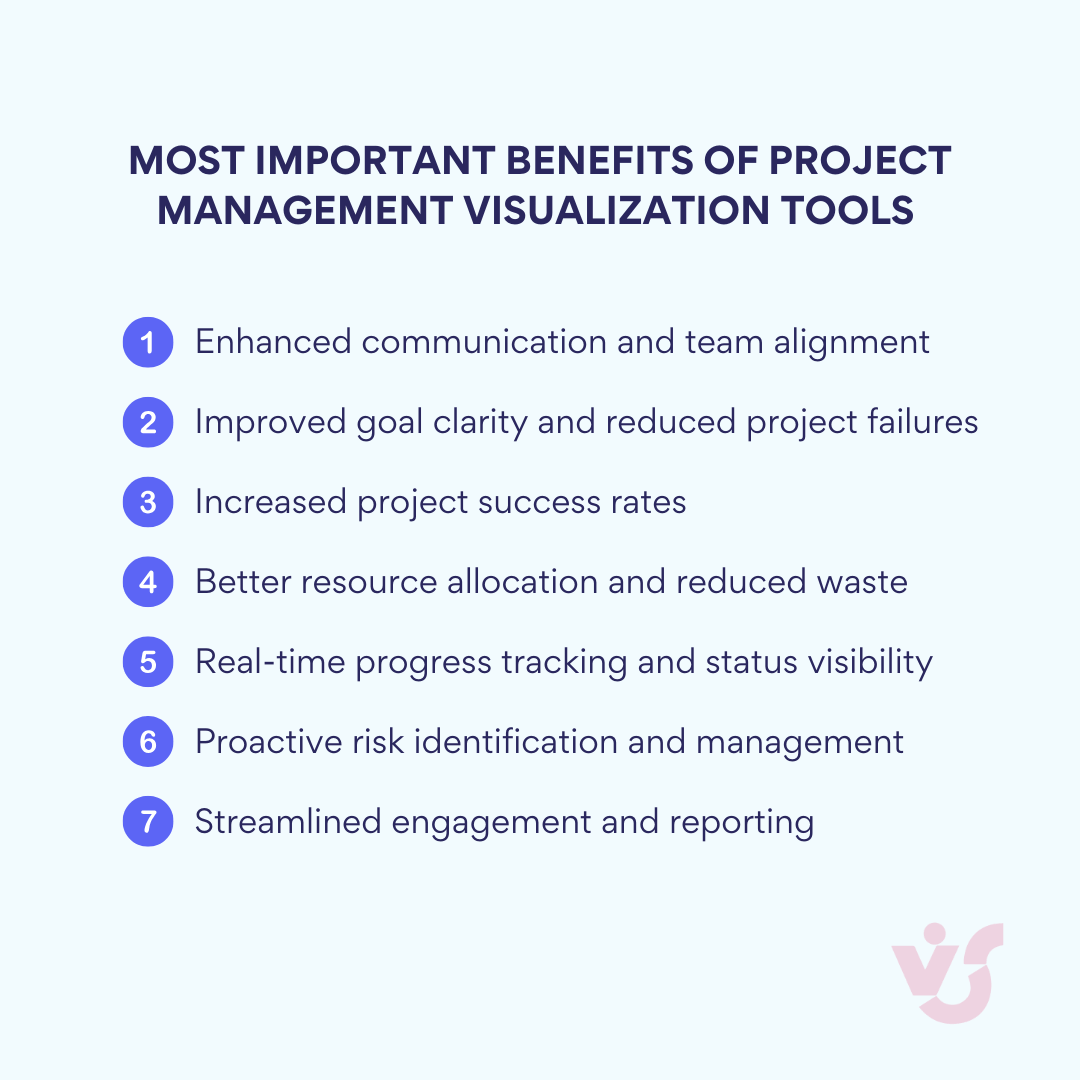
The power of visualization
Project management charts transform complex information into accessible visual formats, offering several key benefits:
- Enhanced communication: Charts create a common visual language that bridges gaps between technical and non-technical stakeholders
- Improved accountability: By clearly displaying who is responsible for what and when deliverables are due
- Better resource management: Visualizing allocation prevents overcommitment and identifies capacity issues
- Early problem detection: Potential bottlenecks and timeline conflicts become immediately apparent
- Progress tracking: Teams can easily track completion against baseline plans
This visual transparency becomes increasingly valuable as project complexity grows. When managing initiatives with multiple parallel workstreams, interdependent tasks, or diverse resource requirements, charts provide the necessary structure to maintain oversight without becoming overwhelmed by details.
Charts vs. diagrams: Choosing the right tool
While often used interchangeably, charts and diagrams serve different purposes in project management:
Project management charts are structured tools that display quantitative information against standardized parameters (like time) and follow specific conventions. They’re ideal when you need to:
- Track progress over time
- Manage resource allocation
- Monitor dependencies
- Adhere to scheduling constraints
Project diagrams offer more flexibility in visualization and typically illustrate concepts, workflows, or relationships. They excel when you need to:
- Explain project concepts
- Map processes or workflows
- Show organizational relationships
- Illustrate system architectures
The right choice depends on your specific needs. When tracking execution against a timeline, a chart like a Gantt is invaluable. When explaining how different components of your project interconnect conceptually, a diagram may be more appropriate.
👉 What are the differences between project management charts, project management graphics, and project management diagrams? Project management charts typically display data and metrics visually through formats like Gantt charts, burndown charts, and earned value charts to track progress over time. Project management graphics are broader visual representations that include infographics, flowcharts, and conceptual models designed to communicate project information in an engaging way. Project management diagrams are structured visual tools like network diagrams, WBS (Work Breakdown Structure), and PERT charts that show relationships between project elements or processes. While these categories overlap somewhat, charts focus on quantitative data visualization, graphics emphasize visual appeal and communication, and diagrams highlight structural relationships. The most effective project managers use all three types strategically, selecting the appropriate visual format based on their specific communication needs and audience. For the purpose of this article, we’ll use the terms interchangeably.
Why Do We Need Project Management Charts?
The transition from project concept to successful execution requires structure, clarity, and coordination. Project management diagrams serve as the visual framework that transforms abstract plans into actionable roadmaps. But why exactly have these visualization tools become indispensable in modern project management?
Key tasks solved by project management charts
Beyond being visual aids, project management charts serve as operational tools that address specific challenges throughout the project lifecycle. When implemented effectively, these visualizations help teams overcome common project hurdles and deliver more predictable outcomes. Let’s explore the fundamental tasks that project management charts help solve:
Project planning
Charts provide the structural backbone for project planning by breaking down complex initiatives into clearly defined stages and tasks. This visual decomposition reveals the logical sequence of work, clarifies dependencies, and establishes realistic timelines. With a properly constructed chart, teams can immediately understand what needs to be done, in what order, and by when. This clarity is crucial, as 37% of project failures are directly attributed to a lack of clear goals and vision according to ProofHub’s 2025 statistics.
Assigning responsibilities
Most project management charts include functionality to designate task ownership, creating immediate clarity around who is responsible for what. This visual assignment prevents duplication of effort, eliminates confusion about accountability, and ensures every team member understands their specific role in the project’s success. At a glance, anyone can see who to approach with questions about particular deliverables. This addresses a significant challenge in project management, as 38% of organizations identify confusion surrounding job roles and responsibilities as a major obstacle to project success.
Time management
Visual representation of timeframes transforms abstract deadlines into concrete constraints. Charts display duration estimates for each task, highlight critical paths, and make schedule deviations immediately apparent. This temporal awareness allows project managers to proactively address delays before they cascade into major timeline disruptions. With 57% of companies exceeding their allocated budgets and time being a crucial factor in cost overruns, effective visualization of project timelines is essential for financial discipline.
Tracking status
Dynamic charts, especially Gantt charts, provide real-time visibility into project progress. Color-coding and status indicators instantly communicate which tasks are complete, in progress, delayed, or not yet started. This ongoing status tracking eliminates the need for constant status meetings and creates a self-service information source for all stakeholders. This is particularly valuable considering that 54% of companies don’t have access to real-time project KPIs, according to Wellingtone’s research.
Communication tool
Charts serve as a universal communication platform—a single source of truth that transcends technical knowledge levels. They provide a common reference point for team discussions, stakeholder updates, and executive reporting. This shared visual understanding reduces misinterpretations and aligns expectations across diverse audiences. Teams using project management software with built-in visualization features report a 52% improvement in team communication, highlighting the critical role charts play in project collaboration.
Benefits of using project management charts
While the practical applications of project management charts are clear, their value extends beyond task management to create broader organizational advantages. These benefits impact not just project execution, but also team dynamics, stakeholder relationships, and overall business outcomes. Here’s why implementing visual project management tools yields significant returns:
Enhanced comprehension
The visual format of project charts dramatically improves information accessibility, particularly for complex initiatives. Where text-based plans might require extensive reading and interpretation, charts convey the same information in an immediately understandable format—making them especially valuable for non-technical stakeholders. This visual processing efficiency is substantial, with research indicating that humans process visual information far more quickly than text, enabling faster decision-making and more intuitive understanding of project complexities.
Increased transparency
Charts create an environment of heightened visibility where nothing remains hidden. Tasks, dependencies, timelines, and responsibilities are displayed in plain sight, reducing questions and building trust. This transparency eliminates information silos and prevents the “I didn’t know” excuse that often plagues projects. It’s no coincidence that 77% of high-performing teams rely on project management software with robust visualization capabilities—these teams understand that visual transparency drives accountability and alignment.
Proactive risk management
Visualization makes potential problems visible before they materialize. By clearly displaying dependencies, critical paths, and resource allocations, charts highlight potential bottlenecks and conflicting priorities. This early warning system enables preemptive action rather than reactive crisis management. Organizations that implement effective project management practices—including visualization techniques—waste 28 times less money than those that don’t, largely due to their enhanced ability to identify and mitigate risks early.
Resource optimization
Charts provide clear visibility into resource allocation across the project timeline, preventing both overallocation and underutilization. Project managers can see at a glance when team members are overloaded or when specialized resources face competing demands, allowing for timely redistribution of work. This visualization capability is crucial given that inefficient project management processes cause nearly 12% wastage of organizational resources, according to recent studies.
Efficient executive reporting
For senior management and key stakeholders, charts offer the perfect executive summary—a comprehensive yet concise overview that can be absorbed in minutes rather than hours. They answer the critical questions: Where are we now? What lies ahead? What risks should we monitor? This efficient information delivery streamlines decision-making and keeps leadership appropriately informed. With 91% of project managers reporting project management issues in their organizations, clear visual reporting becomes essential for gaining executive support and alignment.
The compelling statistics behind project visualization’s impact are clear: projects are 2.5 times more successful when proper project management practices—including visualization techniques—are implemented. As project complexity increases and teams become more distributed, the role of visual project management charts will only grow in importance, serving as the universal language that connects diverse stakeholders around shared project objectives and pathways to success.
Main Project Management Chart Types
Different projects demand different visualization approaches. The diversity of project management graphics reflects the varied needs of teams across industries, project scales, and management methodologies. Each chart type offers unique perspectives on project information, emphasizing specific aspects while abstracting others. Understanding this toolkit allows project managers to select the right visual representation for their particular challenges.
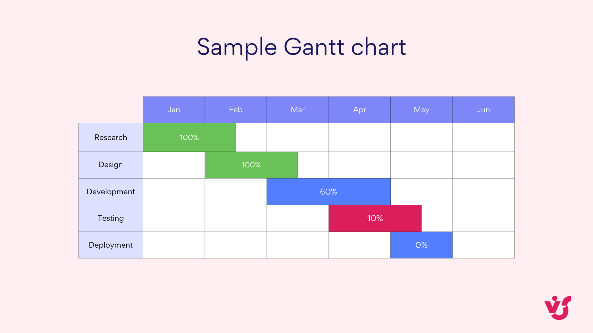
Gantt chart
The Gantt chart stands as perhaps the most recognizable project management visualization tool, providing a comprehensive horizontal bar chart that maps tasks against time. This powerful visual representation shows:
- Tasks arranged along a timeline with start and end dates clearly indicated
- Dependencies between tasks, typically shown as connecting lines
- Progress indicators that display completion percentage for each task
- Resource assignments that identify who is responsible for each deliverable
Gantt charts excel in environments where sequence and timing are critical, making them particularly valuable in industries such as software development, construction projects, and marketing campaign management. Their ability to visualize both the sequential flow of work and parallel activities provides an indispensable planning and tracking mechanism.
👉 Learn more about Gantt charts here: Gantt Chart in Project Management: What Is It and How to Use It
Work breakdown structure (WBS)
The Work Breakdown Structure presents a hierarchical decomposition of the total project scope, organizing deliverables into increasingly detailed components. This top-down visual structure:
- Breaks complex projects into manageable pieces
- Establishes clear scope boundaries for each project component
- Provides a foundation for accurate cost and time estimation
- Creates natural work packages for team assignment

WBS diagrams prove especially valuable during project initiation and planning phases, ensuring no deliverable is overlooked and establishing the fundamental structure upon which other project management graphics can be built.
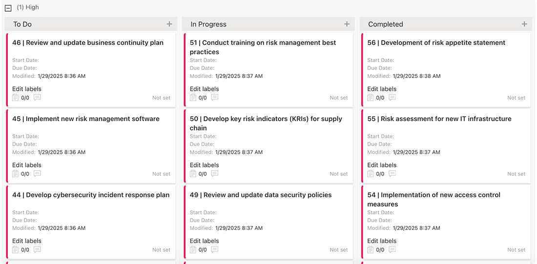
Kanban board
Originating from Japanese manufacturing principles, Kanban boards have evolved into versatile project management tools that visualize workflow through columns representing process stages. A typical Kanban board features:
- Vertical columns labeled with process stages (commonly “To Do,” “In Progress,” “Done”)
- Cards representing individual tasks that move across the board as work progresses
- Work-in-progress limits that prevent overloading of specific stages
- Visual signals highlighting bottlenecks or process issues
Kanban’s simplicity and focus on flow make it particularly well-suited for Agile and Scrum teams, DevOps environments, and any project where continuous delivery is valued over rigid scheduling.

👉 What is a project management schedule chart? A project management schedule chart maps out the timeline of a project’s tasks and milestones. It shows when each activity starts and ends, often highlighting dependencies between tasks. Gantt charts are a common type, using horizontal bars to represent durations. This chart helps teams plan and avoid bottlenecks by visualizing the sequence of work. It’s critical for keeping projects on schedule.
👉Learn more about Kanban here: Agile Kanban: Best Practices and Tools for Project Management & Efficient Multiple Project Management with Kanban: An Expert Guide
Project timeline
The project timeline offers a more streamlined alternative to the detailed Gantt chart, focusing primarily on key dates and milestones rather than granular task management. This visualization typically:
- Displays the project chronology in a linear format
- Highlights critical milestones and deliverable dates
- Provides a high-level overview suitable for executive communication
- Omits detailed dependencies and resource allocations

Project timelines serve as excellent communication tools for stakeholders who need to understand the overall project schedule without being overwhelmed by operational details.
👉What is a project planning chart? A project planning chart is a visual tool that outlines the tasks, timelines, and resources needed to complete a project. It organizes key elements like milestones, deadlines, and dependencies to provide a clear roadmap for execution. Commonly, Gantt charts or timelines are used, showing task durations and sequences. This chart helps teams allocate resources effectively and anticipate potential bottlenecks. It serves as a guide to keep the project on track from start to finish.
👉 Learn more about project timelines here: How to Build and Use a Project Management Timeline: Tips and Examples
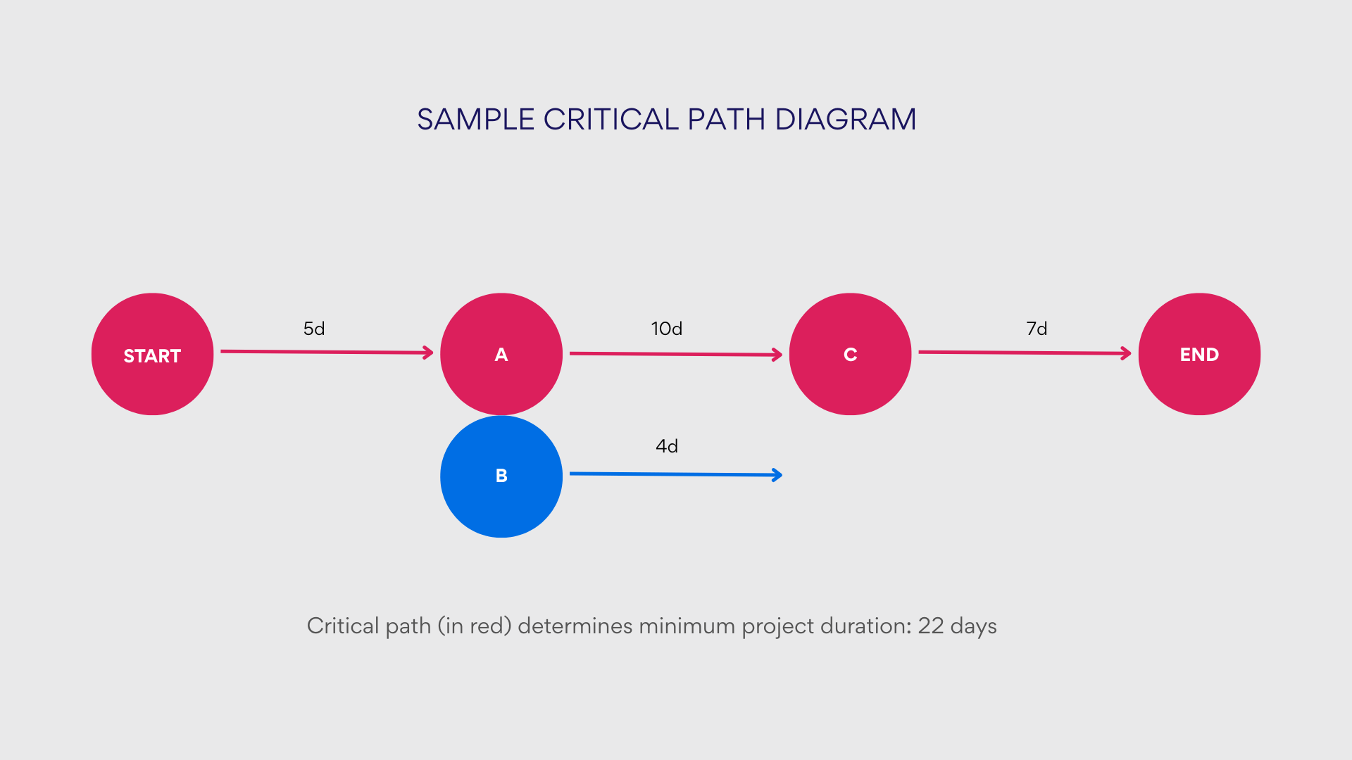
Critical path diagram
The critical path diagram (often created using PERT or network diagram techniques) identifies the sequence of critical activities that determine the minimum project completion time. This specialized visualization:
- Maps all possible task sequences and calculates duration for each path
- Identifies the longest path (critical path) that determines project duration
- Highlights tasks with zero float (where delays directly impact overall timeline)
- Provides insights for schedule optimization and risk management
Critical path diagrams are particularly valuable for complex projects with numerous interdependencies and tight timing constraints, such as construction projects, product launches, or event planning.
👉What is a project progress chart? A project progress chart visually displays how far a project has advanced toward completion. It often uses bar s, lines, or percentages to show task or milestone progress over time. These charts help teams quickly assess whether the project is on track or lagging. They’re commonly used in status reports to communicate with stakeholders. Gantt charts and burn-down charts are popular examples.
Project table
Sometimes the simplest solution is the most effective. The project table presents task information in a straightforward tabular format that includes:
- Task descriptions
- Start and end dates
- Responsible team members
- Status indicators
- Priority levels
While lacking the visual impact of graphical charts, project tables offer clear organization and easy updating for smaller projects or for teams transitioning from traditional task lists to more sophisticated project management approaches.
Here’s a sample project table:
| Task | Assigned To | Start Date | Due Date | Status |
| Market Research | Sarah Johnson | Jan 15, 2025 | Jan 30, 2025 | Complete |
| Wireframing | David Miller | Feb 1, 2025 | Feb 15, 2025 | Complete |
| UI Design | Emma Wilson | Feb 15, 2025 | Mar 15, 2025 | In Progress |
| Frontend Development | Michael Chen | Mar 20, 2025 | Apr 20, 2025 | Not Started |
| User Testing | Jessica Brown | Apr 25, 2025 | May 10, 2025 | Not Started |
👉What is project management table? A project management table is a structured format, often a spreadsheet, that organizes project details like tasks, deadlines, resources, and responsibilities. It provides a clear overview, making it easy to track and manage project components. Each row typically represents a task, while columns cover attributes like status or priority. This tool helps teams stay aligned and ensures critical information is accessible. It’s especially useful for managing complex projects with multiple stakeholders.
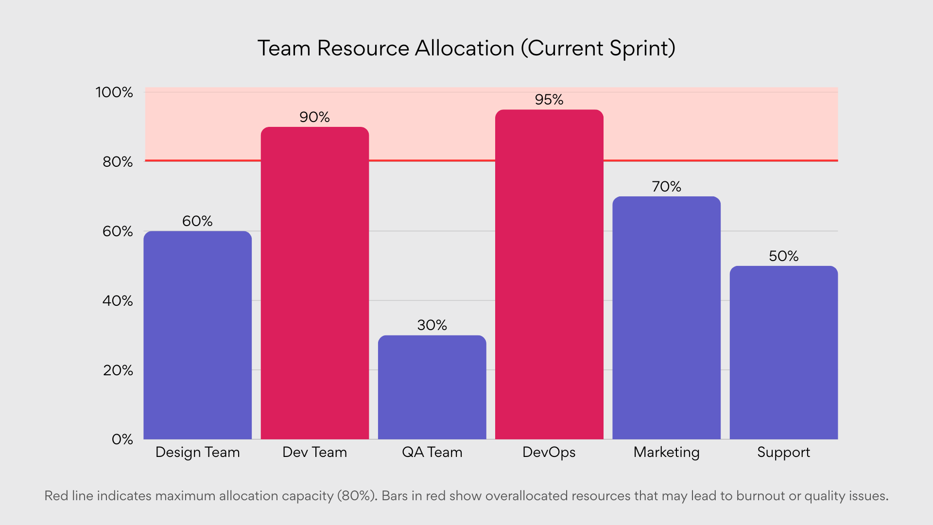
Resource histogram
The resource histogram shifts focus from tasks to the people performing them, visualizing resource allocation and capacity over time. This chart typically:
- Displays resource utilization as vertical bars across time periods
- Highlights periods of overallocation or underutilization
- Allows comparison between capacity and assigned work
- Facilitates resource leveling and capacity planning
Resource histograms prove essential for project managers balancing multiple initiatives across shared resource pools, preventing bottlenecks caused by overcommitment and ensuring team members maintain sustainable workloads.
👉 What is the difference between PMP charts and PM charts? PMP charts and PM charts aren’t standard terms with clear distinctions, but PMP charts might relate to the Project Management Professional framework, focusing on certified methodologies, while PM charts refer to general project management tools like Gantt or Kanban, used broadly across industries. PMP-related charts could emphasize compliance with PMI standards, such as detailed risk matrices. In practice, both aim to visualize project data, but PMP charts may carry stricter process connotations. The difference often lies in the user’s adherence to formal PMP principles versus generic project management practices.
How to Choose the Right Project Chart
Selecting the appropriate project management chart is a critical decision that can significantly impact project visibility, team coordination, and overall success. Rather than randomly choosing a visualization method, project managers should consider several key factors to determine which chart will provide the most value for their specific situation.
Project size
The scope and scale of your project play a fundamental role in determining which visualization tool will be most effective:
Small projects: For projects with limited scope, straightforward timelines, and fewer team members, simpler visualization tools often suffice:
- Project tables provide a clean, tabular view of tasks, deadlines, and responsibilities
- Basic Kanban boards with three columns (To Do, In Progress, Done) can effectively track progress
- Simple timelines that highlight key milestones without excessive detail
These lightweight solutions avoid visual clutter while still maintaining sufficient visibility for smaller initiatives.
Medium and large projects: As project size increases, so does the need for more sophisticated visualization tools:
- Gantt charts become essential for mapping complex task sequences across extended timeframes
- Work Breakdown Structures help maintain clarity when dealing with numerous deliverables and work packages
- Critical Path Diagrams identify schedule bottlenecks and prioritize resource allocation decisions
- Resource Histograms prevent overallocation across multiple concurrent workstreams
The investment in more complex visualization pays dividends by preventing costly coordination errors in larger projects.
Team format (local or distributed)
The geographic distribution of your team significantly influences which visualization tools will maximize collaboration:
Remote/distributed teams: Teams working across different locations or time zones benefit most from:
- Kanban boards with digital access, allowing asynchronous status updates
- Gantt charts with real-time editing capabilities to maintain schedule alignment
- Project timelines that clarify deliverable dates across different time zones
- Digital WBS diagrams with embedded responsibility assignments
These tools create a shared visual language that transcends geographic barriers and time differences.
Local/Co-located teams: Teams working in the same physical space can effectively utilize:
- Physical Kanban boards that serve as visible information radiators
- Project tables reviewed during in-person stand-ups or meetings
- WBS diagrams developed collaboratively during planning sessions
- Resource histograms displayed in common areas to highlight capacity issues
Co-located teams can leverage the power of physical visualization while still maintaining digital records when necessary.
Project complexity and number of dependencies
The interdependence between project elements should heavily influence chart selection:
High dependency projects: When project tasks are tightly coupled with numerous dependencies:
- Gantt charts with dependency arrows visualize the cascade effects of schedule changes
- Critical Path Diagrams identify which task sequences determine the overall project duration
- Network diagrams highlight bottlenecks and potential scheduling conflicts
- WBS with integrated responsible, accountable, consulted, and informed (RACI) matrices clarify handoff points
These tools help prevent the common pitfall of overlooking critical dependencies that could derail project timelines.
Low dependency projects: For projects with more independent workstreams and parallel activities:
- Kanban boards effectively track progress across separate work items
- Project tables organized by team or function maintain visibility without overcomplicating
- Simple timelines that focus on key deliverable dates rather than task interdependencies
- Resource histograms that ensure balanced workloads across independent activities
When dependencies are minimal, simpler visualization approaches can reduce unnecessary complexity.
Reporting requirements
The audience receiving project information significantly impacts visualization choices:
Executive stakeholders: For senior leadership and sponsors who need high-level progress information:
- Project timelines highlighting key milestones and overall progress percentage
- Simplified Gantt charts showing only major phases and deliverables
- Resource histograms demonstrating efficient resource utilization
- Project tables summarizing status by major deliverable rather than individual tasks
These formats deliver maximum information with minimum detail, respecting executives’ limited time.
Clients and external partners: When communicating with those outside the immediate project team:
- Project timelines with clear delivery dates and progress markers
- Simplified Gantt charts focusing on contractual deliverables
- Project tables that highlight key handoff points and approval cycles
- Custom visualizations that align with contractual milestone payments
Client-facing visualizations should emphasize commitments while de-emphasizing internal workings.
Project team: For those doing the actual work, more detailed visualizations are appropriate:
- Comprehensive Gantt charts with task-level detail and dependencies
- Detailed Kanban boards tracking individual work items
- Complete WBS diagrams showing the full decomposition of deliverables
- Detailed resource histograms that clarify individual assignments
Team-level visualizations should provide the granularity needed for day-to-day execution.
Practical selection guide
Beyond the general considerations above, here’s specific guidance for common project scenarios:
For complex projects with long deadlines and dependencies
When managing projects with extensive timelines, intricate task relationships, and multiple moving parts, visualization becomes essential for maintaining control. The right chart must reveal both the forest and the trees—showing the overall timeline while exposing critical dependencies that could impact project delivery. In these scenarios:
Use Gantt charts when:
- The project spans multiple months or years
- Task sequencing is critical to project success
- Resources must be carefully coordinated across multiple workstreams
- Stakeholders require visibility into detailed task-level progress
Gantt charts excel in complex environments by providing a comprehensive view of the entire project timeline, clearly displaying task interdependencies, resource allocations, and critical milestones in a single visual format. They’re particularly valuable when schedule optimization is essential to project success.
For agile, cross-functional teams
Agile methodologies prioritize adaptability, continuous improvement, and customer feedback over rigid planning. For teams working in sprints or iterations, visualization tools must balance structure with flexibility, providing enough guidance without constraining the team’s ability to respond to change. Visual management becomes particularly powerful in these environments:
Use Kanban boards or timelines when:
- Requirements or priorities frequently change
- Teams deliver work in short iterations
- Daily visibility into progress is essential
- The focus is on flow rather than rigid scheduling
These visualization approaches support the adaptive nature of agile methodologies by providing immediate visual feedback on work status, highlighting bottlenecks, and allowing teams to reprioritize work quickly in response to changing requirements or emerging obstacles.
For planning stages or goal decomposition
The initial planning phase demands clarity about what needs to be accomplished before diving into how tasks will be executed. At this critical juncture, teams need visualization tools that help transform abstract goals into concrete, manageable deliverables while establishing clear boundaries for the project scope:
Use Work Breakdown Structures (WBS) when:
- The project scope needs definition and clarification
- Work packages must be identified for accurate estimation
- Responsibility assignments require clarification
- The team needs a shared understanding of deliverables
WBS diagrams excel during project initiation by creating a logical decomposition of deliverables, establishing clear scope boundaries, and forming the foundation for subsequent task planning. They answer the crucial question of “what” needs to be delivered before teams tackle “how” and “when.”
For reporting and monitoring
Effective project reporting requires distilling complex information into clear, actionable insights for various stakeholders. The ideal visualization tools for this purpose balance comprehensiveness with accessibility, presenting progress in a format that quickly communicates status without overwhelming the audience with unnecessary details:
Use project tables, timelines, or resource histograms when:
- Regular status updates are required for stakeholders
- Progress needs to be communicated in concise formats
- Resource utilization is a key metric for project health
- Information must be suitable for inclusion in broader reports
These visualization tools strike the right balance between information density and clarity, making them ideal for recurring status reports, executive briefings, and client updates. Their simplicity aids comprehension while still conveying essential project health indicators.
👉 What types of project management charts are the best? The best project management charts depend on the project’s needs, but Gantt charts, Kanban boards, and PERT charts are highly effective. Gantt charts excel at showing timelines and dependencies, ideal for complex schedules. Kanban boards are great for workflow visualization, especially in agile settings. PERT charts help with risk assessment by mapping task relationships. Choosing the right chart hinges on clarity and project goals.
Where to Create Project Management Charts
Selecting the right tool for creating project management charts is as important as choosing the appropriate visualization type. The software landscape offers numerous options, from dedicated project management platforms to general-purpose applications that can be adapted for project visualization. Your choice should align with your team’s technical proficiency, budget constraints, integration requirements, and the specific chart types you need. This section explores the most popular solutions for creating effective project management visualizations.
Microsoft Project
Microsoft Project remains the industry standard for professional project management, offering comprehensive tools for planning, tracking, and visualizing complex projects. Recent updates in 2025 have reinforced its position as a robust solution for enterprise-level project management.
Key features:
- Advanced Gantt chart capabilities with automatic scheduling and resource leveling
- Critical path analysis tools to identify schedule-driving tasks
- Resource management features, including detailed histograms and capacity planning
- Baseline comparison to track performance against original plans
- Enterprise-grade reporting and dashboard capabilities
- Integration with Power BI for advanced reporting and data visualization
Best for: Large organizations managing complex, resource-intensive projects with multiple dependencies. Microsoft Project excels when detailed planning, precise scheduling, and sophisticated resource management are required.
Limitations: Microsoft Project continues to have a steep learning curve and relatively high cost, making it potentially overly complex for simpler projects. While powerful, it requires significant investment in training to utilize effectively. Cloud-based options, like Project Online, can reduce some of these challenges for organizations new to the tool.
Microsoft Planner
Microsoft Planner has evolved significantly since its introduction, now offering both streamlined basic plans for everyday task management and premium plans with advanced project management capabilities. This tiered approach makes it a versatile solution for organizations of varying sizes and needs within the Microsoft 365 ecosystem.
Basic Planner
Key features:
- Visual Kanban boards for tracking task progress
- Integration with Microsoft Teams, Microsoft To Do, and other Microsoft 365 applications
- Simple task assignment and due date tracking
- Basic charts showing task distribution and status
- Accessible mobile interface for on-the-go updates
- Custom backgrounds to differentiate plans visually
- Board view in My Tasks and My Day for personal task organization
Best for: Teams seeking a lightweight, user-friendly solution that integrates seamlessly with Microsoft’s ecosystem. Particularly valuable for collaborative teams already using Microsoft Teams.
Premium Planner (Planner Plan 1, Planner and Project Plan 3/5)
Key features:
- All basic Planner features, plus:
- Timeline (Gantt) view for visualizing project schedules
- Task dependencies to manage related work items
- Critical path analysis to identify schedule-driving tasks
- Portfolio management for overseeing multiple plans
- Project Manager agent (AI-powered virtual assistant)
- Advanced resource request capabilities
- Baseline tracking for comparing planned vs. actual progress
- Customizable views including Grid, Board, Timeline, and Charts
- Advanced dependencies with lead and lag time capabilities
Best for: Organizations that need scalable project management capabilities that can grow with their needs—from simple collaborative tasks to complex, multi-team projects.
Limitations: While premium Planner plans have significantly narrowed the gap with Microsoft Project, some users report ongoing challenges with certain advanced features. For instance, as of early 2025, some users have noted limitations with recurring tasks in premium plans. Additionally, the transition between basic and premium plans can involve some adjustment as the interfaces and capabilities differ.
👉 Learn more about Microsoft Planner here:
- Microsoft Planner Premium: Boost Productivity & Collaboration
- Trello vs Microsoft Planner: Which is Better for Teams?
- Explore Microsoft Planner 2024: What’s New for Task Management
- MS Planner vs Project: Which Is Right for Your Team?
- Microsoft Planner Alternative: Find the Best Project Management Tools for Your Team
Integration between tools
The distinction between Microsoft Project and Planner has blurred significantly in 2025, with premium Planner plans incorporating many Project-like features. Organizations can now choose the right level of complexity based on their specific needs, with the ability to scale up as projects become more sophisticated. The licensing structure reflects this convergence, with plans like “Planner and Project Plan 3” combining capabilities from both product lines.
For organizations considering which tool to adopt, the decision now depends less on feature differences and more on the complexity of projects, team size, budget constraints, and required learning curve.
Excel / Google Sheets
Spreadsheet applications like Excel and Google Sheets offer surprising versatility for creating project visualizations, especially when dedicated project management software isn’t available or necessary.
Key features:
- Highly customizable templates for project tables and simple Gantt charts
- Conditional formatting to highlight status and deadlines
- Basic charting capabilities for resource allocation visualization
- Familiar interface that reduces training requirements
- Easy sharing and collaboration (particularly with Google Sheets)
- Excel offers advanced features like Power Query and Power Pivot for data automation
Best for: Small teams with limited budgets or organizations requiring custom visualizations not available in standard project management tools. They are particularly valuable for ad-hoc project tracking or when simplified reporting is sufficient.
Limitations: Manual maintenance can be time-consuming and error-prone. These tools lack automation for dependency management or resource leveling. While Google Sheets offers real-time collaboration, Excel’s capabilities in this area are limited unless using the online version.
Trello / Jira / Asana
These popular task management platforms each offer distinct approaches to project visualization within broader work management ecosystems.
Trello
- Intuitive Kanban board interface with customizable columns and card details
- Power-Ups that extend functionality for timeline views, Gantt charts, and reporting
- Simple, visual approach that’s accessible to non-technical users
- Excellent mobile experience for on-the-go updates
Best for: Teams looking for a lightweight, highly visual tool for managing tasks and workflows. It’s ideal for smaller, straightforward projects.
Jira
- Sophisticated Kanban and Scrum boards with customizable workflows
- Roadmap views for visualizing project timelines and dependencies
- Advanced reporting and dashboard capabilities
- Deep integration with software development tools
Best for: Agile software development teams requiring flexible workflows, backlog management, and integration with DevOps tools.
Asana
- Visual Kanban boards with customizable fields and views
- Timeline view for visualizing schedules and dependencies
- Workload view for monitoring resource allocation
- Portfolio-level reporting for managing multiple projects
Best for: Cross-functional teams, especially in marketing, operations, or creative fields, needing a balance of advanced features and visual simplicity.
Limitations: Advanced features often require premium subscriptions. Integration with external systems can be challenging without additional middleware. Each platform has its strengths and weaknesses: Trello for simplicity, Jira for software development, and Asana for cross-functional collaboration.
SharePoint Online (Including Gantt Chart web parts)
SharePoint combines document management with project visualization capabilities, making it particularly valuable for documentation-heavy projects.
Key features:
- Built-in list views that can be configured as simple Kanban boards
- Third-party and custom web parts for Gantt chart visualization, such as the Virto Gantt Chart App
- Deep integration with Microsoft 365 for document management
- Customizable dashboards and reporting options
- Advanced permission management for controlled information sharing
Best for: Organizations heavily invested in the Microsoft ecosystem, particularly those with significant documentation requirements alongside project management needs.
Limitations: SharePoint’s native project visualization features are limited without customization or third-party extensions. For example, the Virto Gantt Chart App significantly enhances its Gantt chart functionality, making it easier to manage project timelines and dependencies.
Visio / Lucidchart
Dedicated diagramming tools like Visio and Lucidchart offer precise control over visual elements, making them ideal for creating certain types of project charts.
Key features:
- Professional-quality Work Breakdown Structure (WBS) diagrams
- Customizable Critical Path and PERT chart templates
- Process flow visualizations for complex project methodologies
- Extensive shape libraries for professional-looking diagrams
- Advanced formatting and layout options
Best for: Creating polished, presentation-quality project visualizations, particularly for structural diagrams like WBS or network diagrams. These tools excel when the visual clarity of the diagram is paramount.
Limitations: These tools are not designed for ongoing project tracking or updates. Charts are generally static representations that require manual updates as the project progresses. Collaboration features are also limited compared to dedicated project management tools.
👉 Learn more about project management tools here: Microsoft Planner Alternative: Find the Best Project Management Tools for Your Team
Choosing the right tool
When selecting a platform for your project management charts, consider the following factors:
- Team familiarity: Tools that leverage existing knowledge reduce adoption barriers.
- Integration needs: Connections to other business systems may dictate your choice.
- Scalability: Ensure the solution can grow with your organization’s project complexity.
- Cost structure: Balance functionality against budget constraints.
- Specific visualization requirements: Prioritize tools that excel at creating your most critical chart types.
Many organizations find that a combination of tools provides the best results. For example, you might use a dedicated project management platform like Microsoft Project for detailed planning while extracting data into simpler visualizations, such as Excel or Google Sheets, for stakeholder reporting. The key is selecting tools that enhance rather than complicate your project management processes.
Examples of Using Project Charts
Project management graphics transform abstract plans into visual roadmaps that guide teams toward successful outcomes. While understanding chart types and their applications is valuable, seeing them applied to specific business contexts demonstrates their true power. This section explores five common business scenarios, highlighting how different visualization tools combine to address unique project management challenges. These real-world examples illustrate not just which charts to use, but when and why they deliver meaningful benefits to different organizational functions.
Marketing: Campaign planning
Marketing campaigns represent the perfect intersection of creative processes and structured execution. The complex interplay between content creation, design work, platform coordination, and performance measurement benefits from visualization tools that can adapt to both planning and implementation phases.
Tools: Gantt Chart + Kanban Board
Marketing campaigns involve multiple deliverables across various channels, each with interdependent timelines and resources. Effective campaign management requires both strategic timeline planning and tactical task tracking.
Scenario: A marketing team is preparing a multi-channel product launch campaign involving email newsletters, targeted social media advertising, a webinar series, and supporting blog content. Multiple stakeholders are involved, including copywriters, designers, digital marketers, and external vendors.
How charts are used:
- Gantt Chart (Planning phase):
- Maps the entire campaign on a timeline, showing parallel workstreams for each channel
- Visualizes critical dependencies (e.g., design work can’t begin until copy is approved)
- Identifies resource constraints when multiple deliverables need the same team members
- Highlights external deadlines like product launch dates that can’t be moved
- Allows leadership to see the big picture and adjust timelines proactively
- Kanban Board (Execution phase):
- Organizes tasks by status columns: “To Do,” “In Progress,” “Review,” and “Done”
- Shows workload distribution across team members through card assignments
- Identifies bottlenecks when too many items accumulate in specific columns
- Facilitates daily stand-ups by providing a visual focus for discussion
- Allows easy reprioritization when unexpected changes occur
Advantages: This combination provides both strategic overview and day-to-day clarity. The Gantt chart ensures dependencies aren’t overlooked during planning, while the Kanban board creates transparency during execution, ensuring nothing falls through the cracks. Marketing teams particularly benefit from this approach when managing campaigns with multiple moving parts and tight deadlines.
Product development: SCRUM sprints
The iterative nature of development work, with its emphasis on adaptability and continuous improvement, requires tools that balance structure with flexibility. SCRUM’s time-boxed approach particularly benefits from visualizations that support both tactical sprint management and strategic velocity tracking over multiple iterations.
Tools: Kanban Board + Burndown Chart
In Agile environments, the combination of Kanban boards for workflow visualization and Burndown charts for progress tracking creates a powerful system. These complementary tools support the iterative work patterns, transparent team collaboration, and empirical progress measurement that are hallmarks of effective Agile implementation.
Scenario: A product development team is working on a software update using two-week SCRUM sprints. The project includes implementing new features, fixing reported bugs, and refactoring legacy code. The team needs to maintain a consistent development velocity while adapting to changing priorities.
How charts are used:
- Kanban Board:
- Organizes user stories and tasks across columns representing workflow stages
- Maintains a prioritized product backlog visible to all stakeholders
- Shows sprint commitments through a dedicated “Sprint Backlog” column or swimlane
- Limits work in progress to prevent context switching and improve flow
- Highlights blocked items that require intervention
- Facilitates sprint planning by visualizing capacity and commitments
- Burndown Chart:
- Displays remaining story points or tasks against the ideal completion trajectory
- Provides early warning when velocity drops below expectations
- Creates accountability through visible progress (or lack thereof)
- Helps Scrum Masters identify when team interventions are needed
- Informs capacity planning for future sprints based on demonstrated velocity
- Makes progress transparent to non-technical stakeholders
Advantages: This visualization combination supports Agile’s empirical approach by making work progress highly visible. Development teams benefit from improved focus (Kanban) and pace awareness (Burndown), while product owners gain confidence in delivery projections. The real-time nature of these charts enables the quick identification of impediments before they jeopardize sprint goals.
Event launch
Events represent unique project management challenges because they combine immovable deadlines with complex stakeholder coordination and countless logistical details. Whether organizing conferences, product launches, or corporate gatherings, event management requires visualization tools that can communicate the big picture while ensuring no critical detail is overlooked. The high-visibility nature of events also means failure is immediately apparent, making effective planning tools essential.
Tools: Project Timeline + Checklist
For event planning, two straightforward but powerful visualization tools work in concert. The timeline provides chronological structure and milestone visibility, while the checklist ensures comprehensive coverage of all necessary tasks. This pairing creates an accessible system that balances high-level date awareness with detailed execution tracking—crucial for events where many small details must come together perfectly on a specific date.
Scenario: An organization is preparing for an industry conference, requiring coordination between marketing, logistics, speaker management, and technical production teams. The event has a fixed date that cannot be changed, with multiple preparation milestones leading up to it.
How charts are used:
- Project Timeline:
- Displays the full event preparation period with key milestone dates clearly marked
- Shows parallel workstreams for different functional areas (venue logistics, speaker coordination, marketing)
- Highlights critical deadlines (venue booking, registration launch, agenda finalization)
- Creates shared awareness of the time remaining until the event
- Provides context for understanding how different activities relate chronologically
- Checklist:
- Breaks down complex activities into discrete, actionable tasks
- Organizes items by functional area or chronological sequence
- Provides clear accountability by assigning responsibility for each item
- Enables quick verification of completion status during coordination meetings
- Captures small but critical details that might otherwise be forgotten
- Serves as a reusable template for future similar events
Advantages: This approach balances high-level planning with detailed execution tracking. The timeline provides the “when” at a glance, while the checklist addresses the “what” and “who” with precision. The simplicity of these tools makes them accessible to cross-functional teams with varying levels of project management experience, which is particularly valuable for event planning where many contributors may be involved temporarily.
Construction project
Construction represents perhaps the most visualization-dependent project type, with physical structures literally taking shape according to plans and schedules. The sequential nature of building activities—where one task’s completion becomes the physical foundation for the next—creates intricate dependencies that must be carefully managed. Add in the coordination of specialized crews, equipment scheduling, material deliveries, and regulatory inspections, and you have a complexity level that demands robust visualization systems.
Tools: WBS + Gantt Chart + Resource Allocation Chart
The complexity of construction projects necessitates a more comprehensive visualization approach combining three powerful tools. The Work Breakdown Structure establishes scope boundaries and deliverable hierarchies, the Gantt chart manages the critical sequence of time-dependent activities, and the Resource Allocation Chart ensures appropriate distribution of labor and equipment. Together, these visualizations create a control system capable of managing the complex physical dependencies, specialized resource requirements, and significant financial implications typical of construction endeavors.
Scenario: A commercial building project moving from architectural design through construction phases to final commissioning. The project involves multiple specialized subcontractors, regulatory approval processes, and equipment scheduling requirements.
How charts are used:
- Work Breakdown Structure (WBS):
- Hierarchically decomposes the project into logical phases: site preparation, foundation work, structural framing, mechanical systems, interior finishing, etc.
- Establishes clear scope boundaries and deliverable definitions
- Creates a consistent framework for cost estimation and schedule development
- Ensures no critical project components are overlooked
- Facilitates communication with stakeholders about project composition
- Gantt chart:
- Transforms the WBS components into a time-sequenced schedule
- Visualizes critical dependencies (e.g., drywall installation cannot begin until electrical inspection is complete)
- Identifies the critical path determining minimum project duration
- Shows float (schedule flexibility) for non-critical activities
- Incorporates regulatory approvals and inspection points
- Enables schedule compression analysis when delays occur
- Resource allocation chart (Histogram):
- Displays workforce requirements across project timeline
- Identifies periods of resource over-allocation or underutilization
- Optimizes scheduling of specialized equipment and crews
- Supports cost forecasting based on resource loading
- Facilitates resource leveling to minimize inefficiencies
- Helps subcontractor coordination by clarifying when their services are needed
Advantages: This visualization triad provides comprehensive project control. The WBS ensures complete scope coverage, the Gantt chart manages time dependencies, and the resource histogram optimizes workforce and equipment utilization. Together, they give construction managers the ability to proactively manage complex projects where the coordination of physical dependencies, specialized resources, and sequential work is paramount.
Onboarding new employees
The employee onboarding process presents unique project management challenges because it serves dual purposes: operational efficiency and cultural integration. A successful onboarding program must simultaneously address practical needs (equipment setup, paperwork, access credentials) while nurturing human connections and cultural alignment. Additionally, onboarding typically involves multiple departments with different priorities, creating coordination challenges that benefit from straightforward visualization approaches.
Tools: Project Table + Timeline
For employee onboarding, simplicity and clarity are paramount in visualization choices. The Project Table provides a consolidated view of all required activities with their responsible parties and completion status, while the Timeline establishes clear sequencing and deadlines. This straightforward pairing creates an accessible system that supports cross-departmental coordination while ensuring both technical requirements and cultural integration activities receive appropriate attention throughout the onboarding journey.
Scenario: An organization is integrating new hires across multiple departments. The onboarding process includes paperwork processing, equipment provisioning, system access setup, training scheduling, and introductory meetings with key team members.
How charts are used:
- Project table:
- Lists all required onboarding tasks categorized by responsible department (HR, IT, department manager)
- Specifies deliverables for each task (e.g., completed forms, configured workstation)
- Assigns clear ownership for each action item
- Includes status indicators showing completion progress
- Captures contact information for responsible parties
- Provides space for notes or special requirements for each employee
- Timeline:
- Organizes tasks chronologically from pre-arrival preparations to first-month integration
- Highlights day-one requirements that must be ready before the employee arrives
- Schedules introductory meetings to avoid overwhelming new hires
- Spaces training sessions appropriately to allow for absorption of material
- Incorporates check-in points to assess adaptation progress
- Creates a consistent experience structure that can be replicated for future hires
Advantages: This approach ensures a comprehensive and well-coordinated onboarding experience. The project table guarantees nothing is overlooked, while the timeline creates an appropriate pace for integration activities. HR professionals and hiring managers benefit from reduced coordination overhead, while new employees experience a smoother transition into the organization. The simplicity of these tools allows them to be easily adapted for different roles or departments.
Key insights from real-world applications
These diverse examples demonstrate several important principles for effective project visualization:
- Complementary charts address different project management needs—strategic planning vs. tactical execution, big-picture thinking vs. detailed tracking
- Chart selection should align with project methodology—structured approaches benefit from comprehensive tools like Gantt charts, while Agile methods require more flexible visualizations
- Stakeholder needs influence visualization choices—technical teams may require detailed specificity, while executives need higher-level progress indicators
- Project complexity determines visualization sophistication—simple projects can utilize straightforward tools, while complex initiatives require more elaborate visualization systems
- Effective visualization adapts throughout the project lifecycle—planning-focused charts give way to execution-tracking tools as projects progress
By selecting appropriate visualization tools for specific business contexts, project managers can significantly improve coordination, communication, and ultimately, project outcomes. This deliberate matching of tools to contexts creates several tangible benefits:
- First, context-appropriate visualizations reduce cognitive load by presenting complex information in intuitive formats that align with how teams naturally think about their work. Marketing teams benefit from seeing campaign elements as cards on a Kanban board because it mirrors their modular approach to content creation, while construction managers need Gantt charts that reflect the sequential nature of building activities.
- Second, well-chosen visualization tools enhance team alignment by creating shared mental models. When all stakeholders can see dependencies, timelines, and responsibilities through the same visual lens, misunderstandings decrease and collaborative problem-solving improves. This shared understanding becomes particularly valuable in cross-functional projects where different professional disciplines must coordinate effectively.
- Finally, appropriate visualization tools improve project adaptability by making emerging patterns, bottlenecks, and risks immediately visible. This visual intelligence allows teams to identify and address issues before they escalate, shifting project management from reactive firefighting to proactive opportunity management.
The strategic selection of visualization approaches thus represents a crucial leadership skill rather than merely a technical preference, directly influencing how effectively teams collaborate and how successfully projects achieve their intended outcomes.
How VirtoSoftware Products Help in Project Management
Modern project management demands visualization tools that adapt to specific work contexts and integrate seamlessly with existing systems. VirtoSoftware has developed specialized solutions that enhance Microsoft 365’s native capabilities with purpose-built visualization tools. This section explores two complementary project management applications—Gantt Chart and Kanban Board—that provide robust visualization capabilities while maintaining the familiar Microsoft environment users already know.
Explore VirtoSoftware’s PM Tools

Virto Kanban Board
Boost team productivity with Virto Kanban for Teams: a seamless, efficient task & project management tool.

Virto Kanban Board
This tool transforms team collaboration through visual task management for consistent stage-by-stage progress.

Gantt Chart
Crafted for clarity and control, it offers a comprehensive timeline view that keeps your project checkpoints aligned.
Virto Gantt Chart App for SharePoint Online & Microsoft 365

The Virto Gantt Chart App transforms SharePoint from a document repository into a comprehensive project planning center by introducing timeline visualization directly within the Microsoft 365 environment. This enterprise-level planning tool bridges the gap between SharePoint’s list management capabilities and the sequential visualization needs of complex projects.
The application enables teams to create professional Gantt charts without leaving SharePoint—eliminating the need for third-party tools that fragment the work environment. It supports the full range of timeline planning features, including dependent tasks, precise start and end dates, progress tracking, and hierarchical subtask management. Project managers can customize the display according to various parameters such as status, responsible person, or project category, creating focused views that highlight the most relevant information.
The app’s SharePoint list integration represents a significant advantage for organizations already invested in Microsoft 365. Teams can either use existing task lists or create new ones directly within the Gantt interface. Changes made to the visual timeline—such as dragging tasks to adjust dates or establishing dependencies between activities—are immediately reflected in the underlying SharePoint data, ensuring a single source of truth.
Key benefits of VirtoSoftware’s Gantt Chart View App include:
- Streamlined implementation: Easy installation and minimal configuration requirements allow teams to start visualizing projects quickly without extensive IT support.
- Ecosystem consistency: All project timeline work happens inside SharePoint, eliminating productivity losses from application switching and maintaining the secure Microsoft environment.
- Distributed team support: The cloud-based nature of the solution ensures that remote and hybrid teams access identical, up-to-date timeline information regardless of location.
- Enhanced project transparency: The visual timeline makes potential delays, resource conflicts, and accountability gaps immediately visible, improving predictability and proactive management.
- Flexible deployment: The Gantt Chart App functions effectively as both a standalone solution and as part of an integrated visualization strategy with other Microsoft 365 and VirtoSoftware tools.
Virto Kanban Board App for M365, SharePoint, and Microsoft Teams
While Gantt charts excel at timeline planning, many teams need the flexible workflow visualization that only Kanban provides. The Virto Kanban Board App brings this capability directly into Microsoft Teams and SharePoint, creating visual task boards where teams already collaborate without requiring separate kanban platforms.
This application allows teams to visualize work as it flows through process stages using the familiar card-column paradigm. Users can drag task cards between columns, tracking work progression in real time while maintaining a comprehensive view of the entire workflow. The app fully integrates with SharePoint Lists, allowing teams to visualize existing task libraries or create new ones directly through the kanban interface.
For teams managing numerous parallel activities, the application offers robust filtering capabilities by responsible parties, deadlines, and priorities—making it simple to focus on the most relevant subset of work. The board becomes a visual command center within Microsoft Teams, where all project discussions already take place.
Key benefits of VirtoSoftware’s Kanban Board App include:
- Contextual integration: By embedding directly in Microsoft Teams, the kanban visualization lives where team communication happens, eliminating context switching between collaboration and project tracking.
- Distributed teamwork support: The cloud-based board ensures all team members see identical, real-time status information regardless of physical location—critical for remote and hybrid teams.
- Workflow customization: Flexible column and card configuration allows adaptation to diverse project types from marketing campaigns to software development sprints to administrative processes.
- Visual process management: The board creates immediate visual understanding of workflow status, bottlenecks, and capacity issues—particularly valuable for cross-functional initiatives.
- Enhanced process discipline: All task movements are recorded transparently, reducing communication gaps and creating clear accountability for work progression.

The Virto Kanban Board App particularly excels in supporting Agile development teams, structuring SCRUM sprints, managing internal processes, and facilitating interdepartmental coordination. When combined with the Gantt Chart App, organizations gain a comprehensive visualization system that addresses both timeline-focused planning and workflow-centric execution within their familiar Microsoft environment.
Explore VirtoSoftware’s Project Management Use Cases


Conclusion on Chart Project Management
Project management charts represent more than just visual aids—they are strategic communication tools that transform complex project dynamics into accessible visual formats. By converting abstract timelines, workflows, and resource allocations into intuitive graphical representations, these visualization tools make the invisible visible, allowing teams to recognize patterns, anticipate challenges, and maintain alignment on priorities that might otherwise remain hidden in spreadsheets or text documents.
The effectiveness of project visualization directly correlates with selecting the right chart type for your specific context. Timeline-dependent projects with sequential activities benefit from the chronological clarity of Gantt charts, while workflow-oriented initiatives thrive with the process transparency of Kanban boards. This contextual matching of visualization approach to project type creates a natural fit between how teams think about their work and how they visualize it, reducing cognitive load and increasing adoption.
Modern project management solutions have eliminated the technical barriers that once made sophisticated visualization challenging. Within the Microsoft 365 environment, VirtoSoftware’s specialized applications seamlessly integrate visualization capabilities into platforms where teams already work. This native integration eliminates the productivity losses associated with switching between applications and ensures that visualizations remain synchronized with underlying project data.
For organizations invested in the Microsoft ecosystem, VirtoSoftware’s Gantt Chart App and Kanban Board App provide optimized visualization solutions that enhance SharePoint and Microsoft Teams without disrupting existing workflows. Rather than requiring teams to learn entirely new systems, these tools augment familiar environments with powerful visualization capabilities, creating a low-adoption-barrier path to improved project transparency.
We encourage you to schedule a quick demonstration call and install free versions of both apps from our site to test their functionality and decide for yourself.
Regardless of project scale—from small team initiatives to enterprise-wide programs—effective visualization consistently improves outcomes by creating shared understanding, highlighting emerging issues, and facilitating more informed decision-making. As projects become increasingly complex and teams more distributed, the strategic implementation of visualization tools represents not just a technical enhancement but a fundamental leadership approach that directly influences how successfully teams collaborate toward common goals.
Explore these resources to deepen your understanding of project management visualization approaches: